A friend of Tessa’s from college contacted us recently asking for help with her sewing area. Cheryl is a mom of four kids who lives in Charlotte, N.C. and has managed to carve out a corner of her bedroom as a personal area for sewing and craft projects.
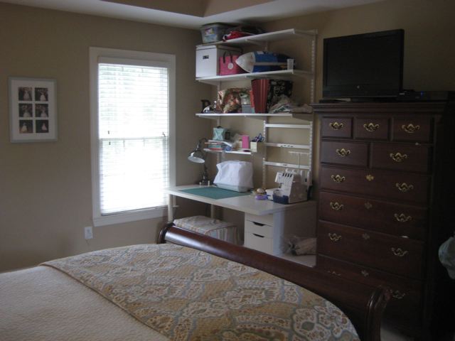
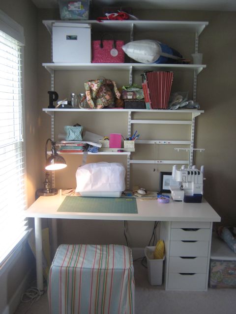
While the rest of her bedroom is very neutral, Cheryl wants her sewing nook to be fun and inspiring. She recently purchased the shelving at Container Store and desk at Ikea so wants to keep those two things along with all other furniture in the room. With four kids and also a blogger over at Charlotte Smarty Pants Cheryl didn’t have the time, nor energy to go beyond her purchases and told us she’s been too scared to pull the trigger on anything else. Her wish list is for it to look organized and creative with places for fabric, notions, accessories, different crafts like embroidery and card making. To help Cheryl move on to the next step, we thought we’d give her a couple of perspectives with different inspiration photos.
Amy’s Perspective
I wanted to create a space for Cheryl that would look organized, be functional and flow with the rest of the room since it’s located in the master bedroom. She has a nice corner space that just needs every inch utilized to give her maximum work and storage space.
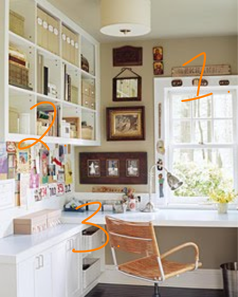
1. I was instantly drawn to the window in their bedroom and think moving the desk in front of the window would lessen the load of furniture on the back wall. I think the current placement of the desk looks dark because it’s located under the shelving system. I would also add drapes to the window to balance out the adjacent wall with the shelving system.
2. An inspiration board is always a MUST in a creative space to post ideas and project photos for reference. This board would go under the current shelving system.
3. Underneath her existing shelving unit, I would build narrow shelving with doors on the front and add countertop to increase work space.
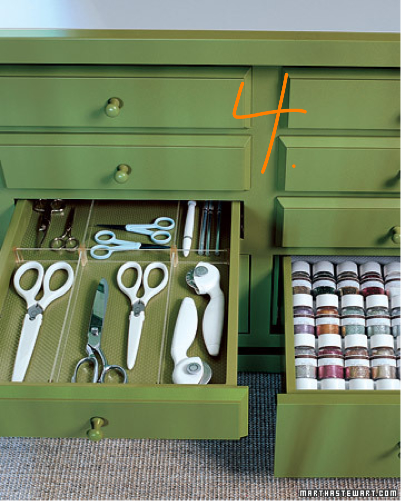
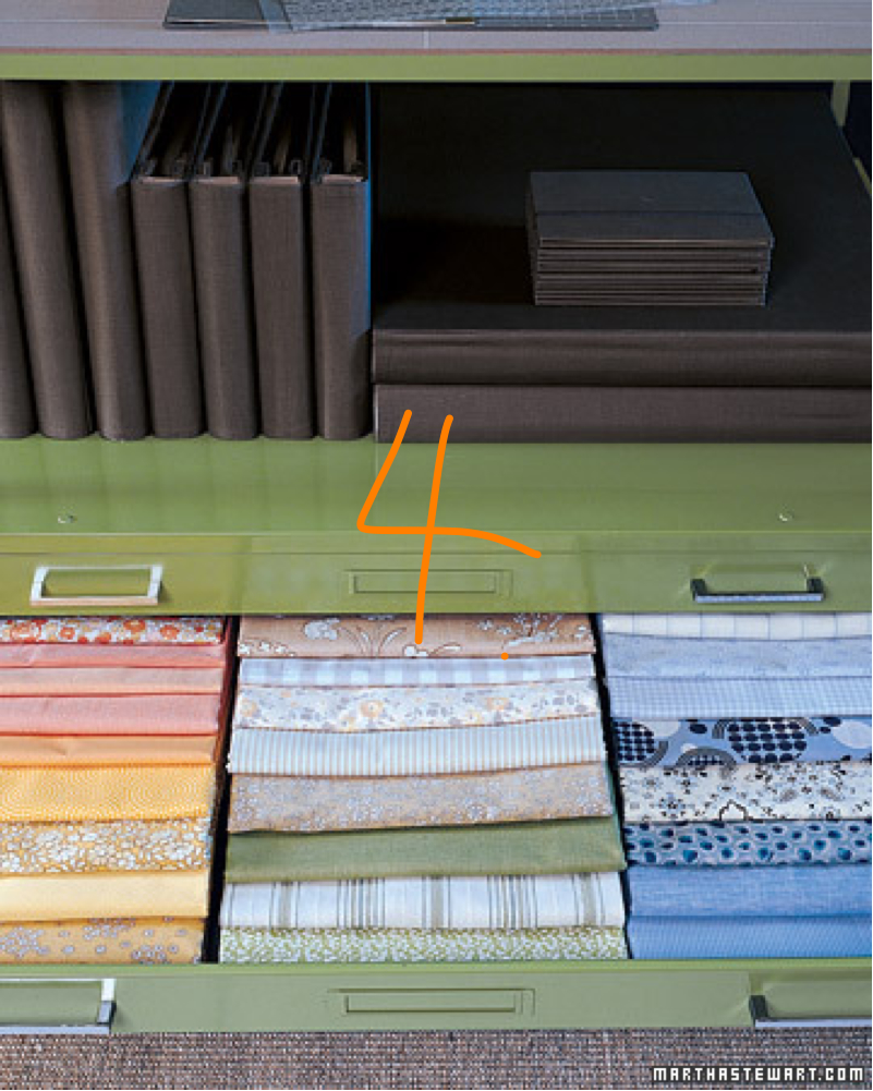
4. A furniture piece with narrow pull-out drawers is great for storing fabric, spools of thread, and laying out all of your tools. Cheryl also mentioned that she needs a space for card making supplies. Wouldn’t it be great to pull open a drawer and see all of your stamps top side up with designs showing (I would alphabetize them but that’s another post)? Deep drawers always pose the risk of things getting lost.
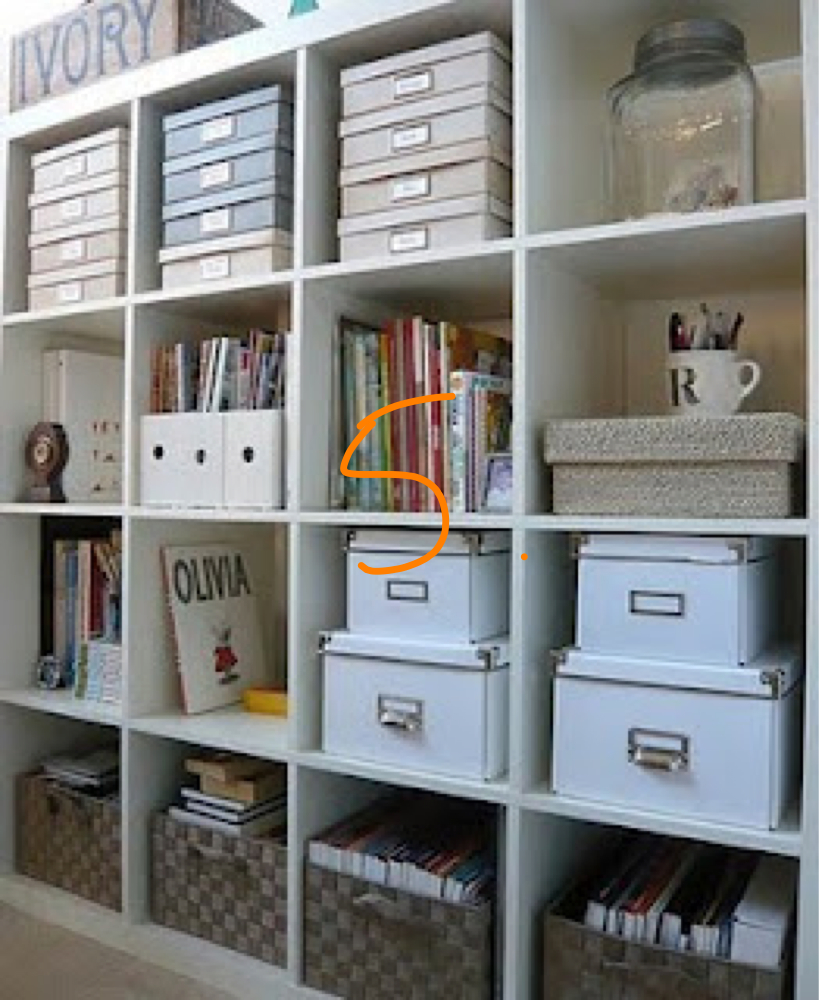
5. I would keep the baskets and containers neutral with small pops of color to flow with the rest of her bedroom. However, I would incorporate different textures like the photo above to keep it interesting.
Tessa’s Perspective
Everyone should have a little space of her (or his!) own. I love the idea that Cheryl wants to bring some fun into her area, but we also want to make sure that it flows with the rest of the room. Because her sewing nook is in the bedroom, I would suggest keeping the space neutral with small pops of color so it doesn’t overwhelm and conflict with the rest of her room.

1. In a sewing area, working space is essential so I would suggest freeing up the top of the desk by mounting a wall sconce to the right of the window. I would also challenge Cheryl to try to free up a couple of her dresser drawer’s for storage of fabric so she doesn’t have to bring additional furniture into the room. That way the fabric could be folded nicely and stored in an existing dresser.
2. Above the sconce, Cheryl could put a long narrow bulletin board on which she could pin inspirational photos, etc.
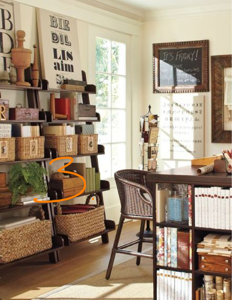
3. Because we’re keeping the recently purchased existing wall unit and desk as well as the dresser seen in the first picture, I would create more cohesion with the other furniture in Cheryl’s bedroom by bringing in some darker toned baskets in two sizes for storage on the white shelves. In the inspiration photo above, I like the two sizes of baskets, but would actually take my inspiration from the darker wood tones of the furniture and wicker stools.
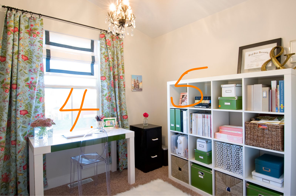
I thought Cheryl would really like this office from Kristen at 6th Street Design School blog so using it as inspiration, I would bring color into Cheryl’s space in a few ways:
4. Pulling the light blue out of the bedspread, I would recommend dressing up the window with a simple roman shade with a border (a project for Cheryl perhaps??). Instead of heavy drapery which might crowd Cheryl’s corner, I would bring pattern into the room by way of a comfortable chair with a pattern–not matching, but in complementary colors to the bedspread. This chair could then be used as additional seating in the living room if needed. While the stool she currently has is nice because it can be pushed under the desk, a chair with a back is way more comfortable when you’re sewing for long periods of time.
5. In between the baskets on the shelves, I’d intersperse pops of the color blue with storage boxes of different shapes and sizes that can be labled–thread, scissors, etc.
Tomorrow, we’ll post a couple of inspiration boards with links to specific products so check back!


So my friend was over today and helped me move my desk to the window – it’s so pretty!!! Step 1 done! 🙂
Hope it’s coming along and you like the desk by the window. Keep us posted!
Maybe there is hope for my craft room yet? Bet you would love to get your hands on it Amy! OK, I’m going down there to work because I am so inspired….
Yes, I would love to get my hands on that HUGE craft room of yours. So much potential!