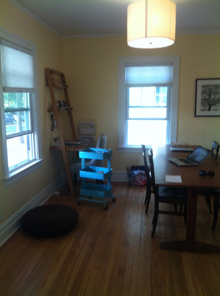
In yesterday’s post we shared Julie’s office/dining room photos and some inspiration shots. She wants this space to serve two purposes: an eating area and a work space but she doesn’t want it to look like a work space. In designing this room Julie told us she likes a neutral palette that would go well with her existing yellow paint. We stuck to a neutral palette and to give the space depth we used subtle pattern. We also chose some items with texture and picked different finishes in the furniture to make it interesting.
A reminder of what Julie’s space looks like now:

And here’s what we shared with Julie as a blueprint for her new space:
1. We would frame both of the windows with curtains in this subtle pattern. This would make the windows appear larger and give it a more formal feel.
2. We chose a parsons desk/console for the work space. This would be positioned under the window (left hand side of photo) and her current desk would be taken out of the room. This console would serve two purposes: one, it could be used as a desk (there is a pull out drawer on the front) and two, it could be used as a key drop since they currently do not have a place for keys. By putting two lamps at both ends of the console, it doesn’t make it feel like a desk. This could also be a spot for serving food when they entertain.
3. The two ottomans below have hanging file rack storage for her files or she could store office supplies inside. To keep it from looking like an office space, we didn’t choose a desk chair, instead she can pull one of the dining room chairs up to the desk. The ottomans could also provide extra seating when needed in the living room adjacent to the dining room.
4. Oh, how I love this table! The rustic wood pairing with a modern desk/console is gorgeous. A pendant light (this one is covered in a gray grasscloth) mimics the shape of the lampshades on the desk. The eames chairs are comfortable, modern and a mix of this otherwise traditional table with modern chairs is the perfect balance in the room.
Hope you enjoyed our latest design-let us know what you think! And don’t forget if you click on the small images above, you can source all the items.


Wow! I love all of these ideas! I may finally have a nice dining room!
fabulous as usual, girls!!! LOVE this.