We usually feature homes on Fridays, but I thought it would be fun to show you this gorgeous home and then tomorrow show you how you can re-create the look in your own home. Did you know that (amazing home decor sale site) One King’s Lane does home tours? Take a look at this stunning home that belongs to Lauren Weisbarth-sister of One Kings Lane co-founder, Alison Pincus (who we were lucky enough to meet at an event at the Rug Company for Martyn Lawrence Bullard a couple of years ago and is so nice…yup, name dropping, but love it when success comes to nice people!)
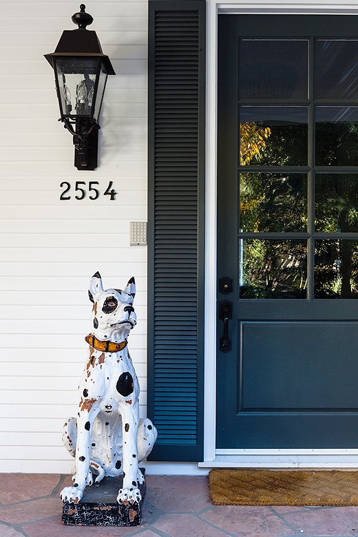
I’ve always wanted a door with lots of windows on top. The icing on the cake would be it if was a dutch door! Also, love the narrow shutters flanking the door.
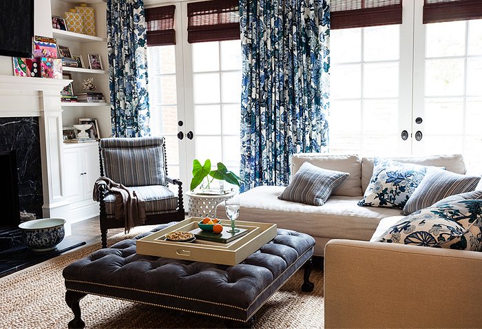
This mix of florals and stripes in the same color is so inviting. Also, a simple trick for anyone struggling with mixing pillows with drapes. Keep it simple by picking a floral and stripe and use throughout the room. The rug, roman shades and ottoman bring texture to this room and keep it from feeling too formal with all of the floral. Brilliant!
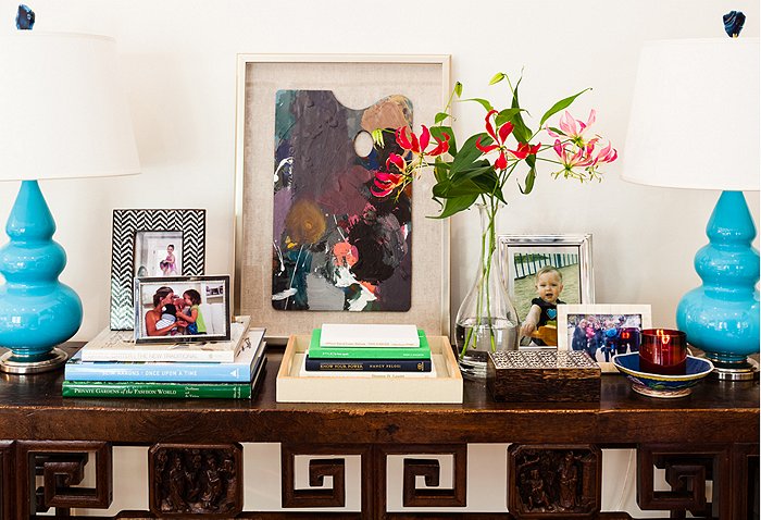
A great vignette filled with family photos and personal objects on an entryway table. Definitely a warm table to greet visitors. And, you can really see the influence of One King’s Lane in this picture–little unique collectibles that lend an eclectic, personal feel to the home.
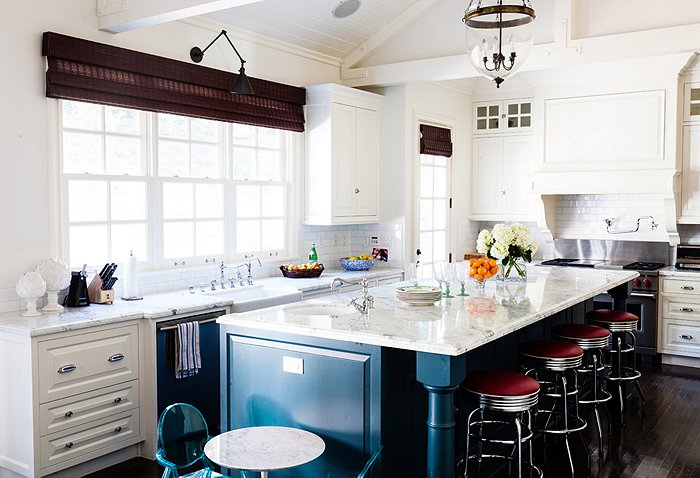
Love, love this kitchen! These days I’m loving kitchens with very few overhead cabinets or none at all. I think it really opens a kitchen up and doesn’t create a heavy feeling. The only thing I would change is the barstools. I would love to see some lucite barstools instead of the diner ones.
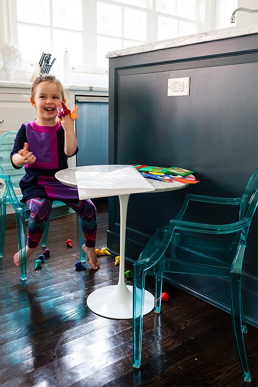
How cute is this kid’s tulip table with lucite chairs? ADORABLE!
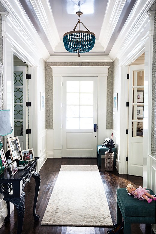
The texture on the wallpaper is beautiful. I would have chosen a crystal chandelier for the entry but I do like the mix and matching of materials in this room–also this light fixture has that relaxed California feel about it. The idea of two benches in the entry is great and functional.
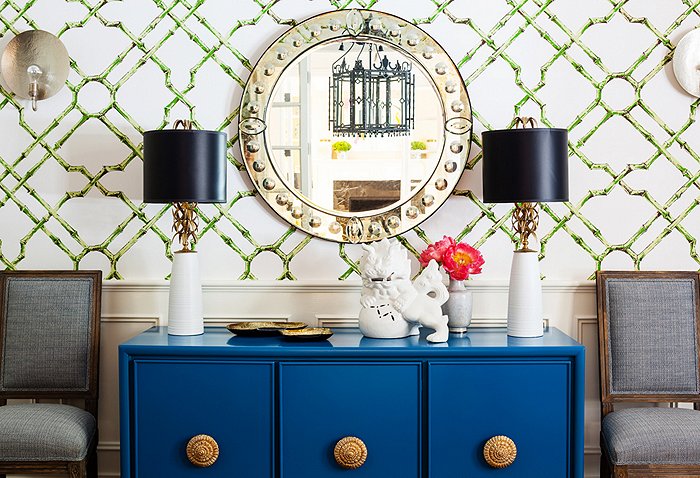
The pop of blue is gorgeous and very unexpected!
I love how they’ve created continuity throughout the home by using the same color palette (those pops of different blues.) The colors are still interesting, but the space feels calm because of the consistency from room to room. Check back tomorrow and I will show you how to get Lauren’s look in your own home.


One comment on “Home Feature”