Unless you’ve been living under a rock, you’ve heard of the Fifty Shades of Grey trilogy. I gave in and read it…read all three. Terrible writing–I mean, terrible–cliche and repetitive–but also, terribly entertaining and I did somehow manage to get through all three. While most people are talking about who will play Christian and Ana in the movie, I’m more interested (sad, I know) in how they’ll style Christian Grey’s infamous Escala condo.
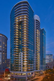
There have been a lot of news articles and blog posts in the last couple of weeks about the fact that Escala is actually a real building in the Belltown neighborhood of Seattle. Penthouses are now for sale between 4-6 million. Wonder how much the books boosted that price?
Here’s a pic of the real Escala
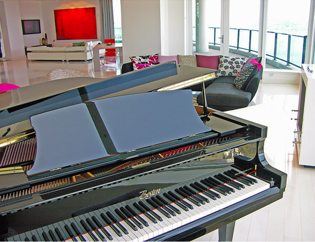
You can tell from these shots of the penthouse, the designer took direct inspiration from the books (or perhaps vice versa–not sure if the author ever visited the actual building and when it was decorated) — all white walls, sectional, modern decor, stainless steel fireplace and black grand piano…
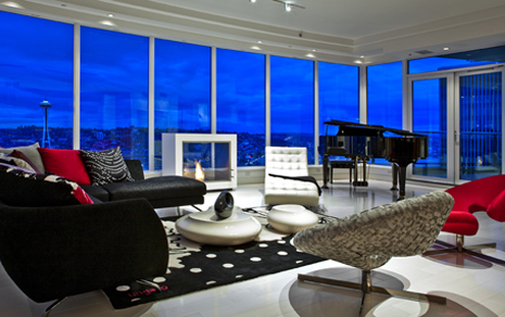
Another angle so you can see the phenomenal view–you can’t land a helicopter on the roof (shoot, I was so ready to buy!) but you certainly have those views they talk about.
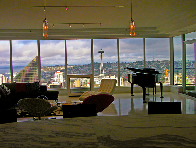
Oh that piano… And, check out the area in the background–I like how they’ve “subtly” incorporated red!
Large dining table and modern kitchen:
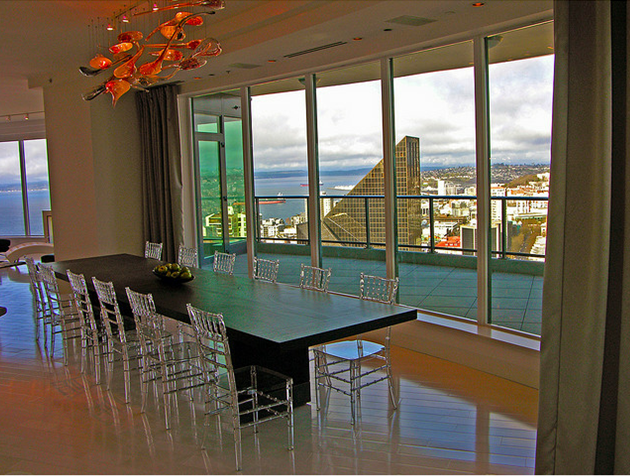
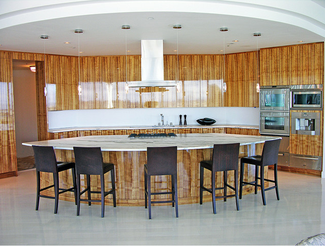
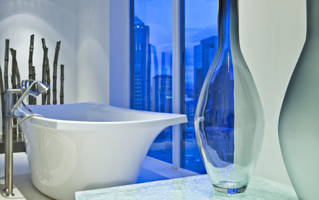
The bathtub…
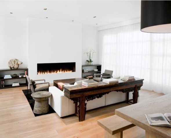
But, despite reflecting the description of Grey’s condo in the books, these rooms aren’t exactly what I envisioned for Grey. I hope in the movie version, they go cleaner and more masculine. For example, this San Francisco bachelor pad by designer Nicole Hollis has elements of how I picture Grey’s condo–contemporary, white walls with touches of black and wood; clean lines; masculine and sleek without quite being cold.
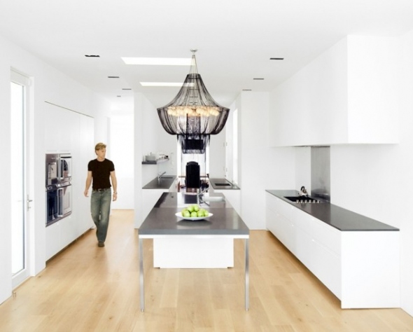
Grey’s kitchen is described as all white with dark wood worktops (for a Seattle couple they sure use a lot of British lingo!) Take away the chandelier, throw some white and chrome bar stools around that counter, and I think it would be the perfect place for Mrs. Jones to cook. BTW, I seriously couldn’t have planned this picture better–take note of the worn jean and black t-shirt on the guy! (Sorry for those of you who haven’t read the books–lots of references.)
Here’s how I would design Christian Grey’s living room.
While the book describes his living space as having a u-shaped white sectional, that just doesn’t seem right to me. Instead, I’d choose a sleek contemporary Italian sofa in a very light gray to give just a touch of depth to a room with all-white walls. I’d pair it with a modern coffee table with a little wood to soften the room and a super sleek Barcelona couch in black leather that is low and therefore draws your eye out to the view; the black leather balances the dark grand piano. I’d add a modern Hans Wegner wing chair for some height to balance the arc floor lamp. This stainless steel fireplace would be perfect as it’s eco-friendly as well as transparent so, again, the view is the star. The art work throughout the house would be all original, valuable and modern like this Jackson Pollack–a little dark with light undertones just like Grey himself (not that I’m over analyzing this or anything…) And, of course the piano, can’t forget that.
Read the book? How did you picture Grey’s living room? If you haven’t, it’s a great summer read if you just keep your expectations on writing low.



I agree with your pics, Tessa! The other photos are a bit too colorful IMHO.