As a follow up to yesterday’s post, I wanted to unveil my new, wallpapered dining room! There was some serious debate as to which room I should wallpaper and which print I should pick. In the end, a couple of things solidified my decision to add wallpaper in the dining room over other rooms in my house. First off, because it’s a small room with two doorways, two windows and a built-in cabinet–there wasn’t much wall space to hang artwork. The wallpaper becomes the ‘artwork’ for the room which is all I needed to make this room really ‘pop’! I also chose the dining room because this is not a room that we use a ton. I thought it would be a safe route to wallpaper a room that I didn’t sit in everyday so that hopefully, I won’t grow tired of the pattern in the near future.
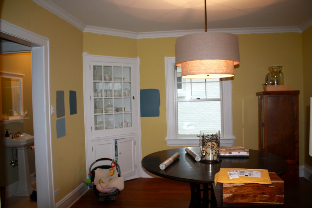
Just a reminder…here is what it looked like before the wallpaper:

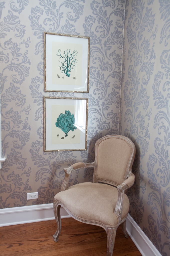
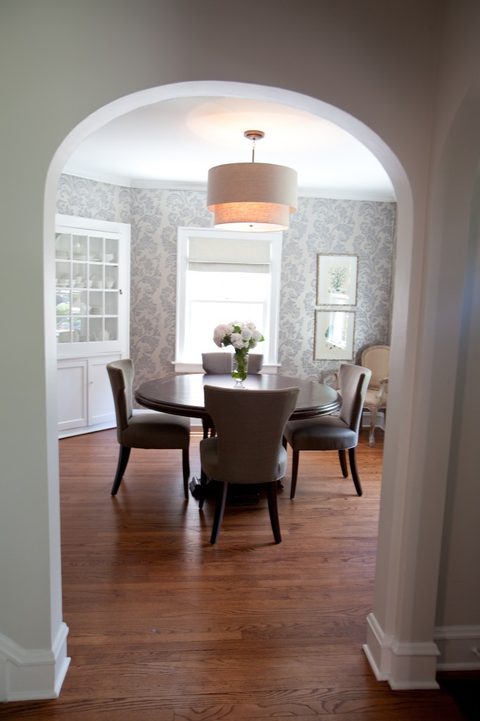
And here is my dining room with a little flair of the wallpaper…I heart this room so much and it’s one of the first rooms you see when you enter my house. When I saw this print, I instantly knew it was the one for me!

It’s nerve-wracking hammering a nail through wallpaper! Definitely think about your room you decide to wallpaper, once you hang an item it’s not like paint where you can do touch-ups.

My hanging light pendant was one of the first things I purchased for my house. I fell in love with this light fixture and bought it one week after moving in. If I would have wallpapered this room first, I probably wouldn’t have choosen this fixture. I wouldn’t have thought the wallpaper and light fixture would have been a good match. However, I’m so happy with the overall look. I think the light fixture ‘tones’ down the room to not make it feel too formal. Sometimes it’s best to buy things you love because they always seem to work themselves into the room.

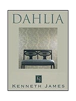
By the way, my kids are always running through this room and so far the wallpaper has held up great. When I do notice some greasy handprints, I just use a damp rag and it washes right off. I ended up choosing a wallpaper from Kenneth James. It was actually the wallpaper on the front cover of the book. I found an online retailer that was selling the wallpaper at a much cheaper price than my local paint store. Once you find the wallpaper you love, don’t be afraid to check online for a better price.


Amazing what color changes do for a room!!
I love your dining room transformation! I follow your blog, and love all your wonderful ideas and tips!
Thanks Beverly! So glad you found our blog.
The room looks beautiful, Amy. Love the wallpaper choice and your blog! 🙂
Thanks Katie! Glad you found our blog!
The room looks very elegant!
Wow it’s amazing how much the paper changes the whole look and feel of the room! Love the paper, and totally agree the light fixture works really well with it. Well done!
looks like a picture straight out of a design mag! well done, amy! i agree–i wouldn’t have thought to pair that fixture with that paper but it totally works.
Thanks Carrie! Did you ever decide to wallpaper a room in your house? I know at one time you were thinking of adding some.