It’s fun when we get a real challenge. A few weeks ago a reader in California contacted us about helping her with her living room. Melissa has an open concept kitchen/dining/living area that’s she just not sure how to use–the size of the overall space and placement of a large fireplace is driving her a little crazy when it comes to furniture placement.
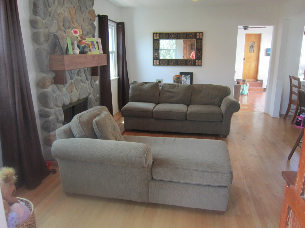
Here’s the angle you get when you walk into the room from the front door–you can see the big stone fireplace flanked by windows:
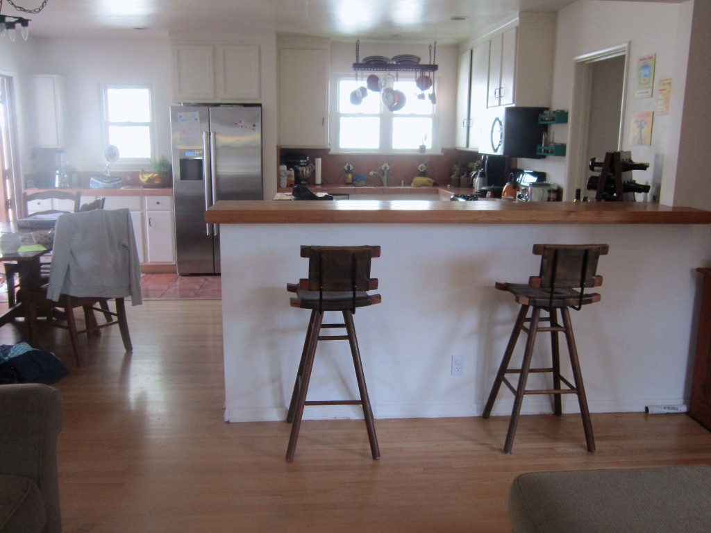
And opposite the living area is a kitchen and dining area–this angle is from standing in the living room:
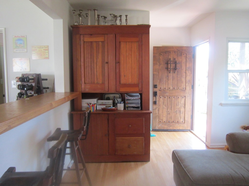
And, looking back toward the front door from the living area–this hutch is the one piece of furniture that Melissa and her husband would like to keep.
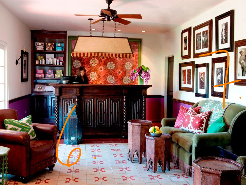
Melissa and her husband like Spanish Colonial style–they requested a space that is reminiscent of a boutique Mexican hotel. Living in Chicago we don’t get a lot of chances to work on a project of this style so it’s been a fun project that also required the right inspiration. When we sat down to pick our inspiration shots, we really focused in on how we envision a contemporary take on Spanish Colonial–contrasting neutrals with dark, rustic woods, black iron and pops of rich colors in fabrics and tile work–reds, blues, greens. We also wanted to ensure that the the living area is family-friendly and a fun, comfortable space for the family to hang out and entertain friends.
Remember when we posted about Reese Witherspoon’s Ojai home earlier this month? We actually used her living room shot as inspiration for this project because she’s made the fireplace a focal point by arranging the furniture around it.
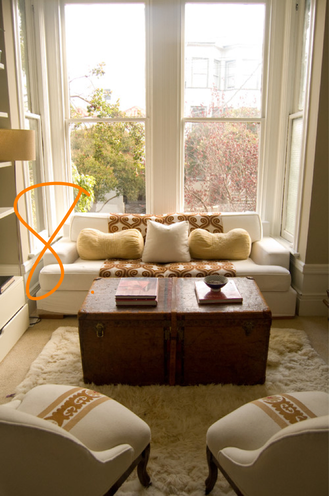
1. We want to make the fireplace more of a feature of Melissa’s room so we’d suggest a light, neutral, clean-lined (for scale) upholstered sofa facing the fireplace with two chairs flanking it to create an intimate conversation area. The chairs would be wood to juxtapose the upholstery of the sofa and create interest in the room (Reese’s chairs create the same effect in leather.) The new couch placement would also create separation between the kitchen and living area.

2. For the windows, we’d recommend neutral cotton drapes (with a bit of texture) on wrought iron rods.

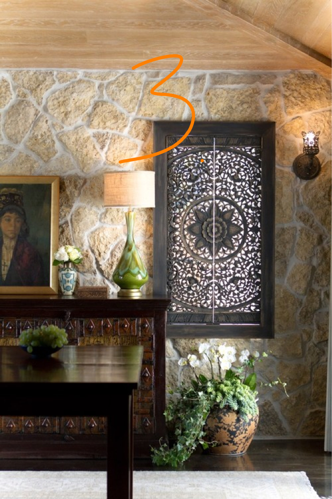
3. Over the fireplace, we’d then break up the stone with interesting metal screen–one large statement piece will work better than the small frames they have now. To balance the fireplace, we’d move the hutch to the wall to the right of the fireplace (where there is a mirror now) While it technically fits perfectly in its current location, we like to give big furniture room to “breathe” and putting it on that empty wall will do just that.
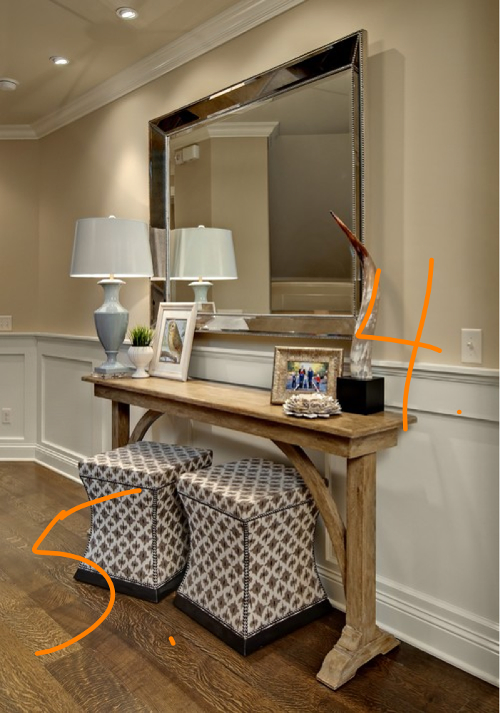
4. Where the hutch currently is, we’d replace it with a simple console with a mirror above it to be used as a key drop.
5. Below the console, we’d place two benches–for Melissa’s room, we’d recommend using two with metal x bases and leather tops which would be more in keeping with the style of her room.


well done, girls! your inspiration shots are fabulous and i love the tip on letting large furniture pieces “breathe”–had never thought about that before but it makes perfect sense.
can’t wait to see your picks tomorrow!