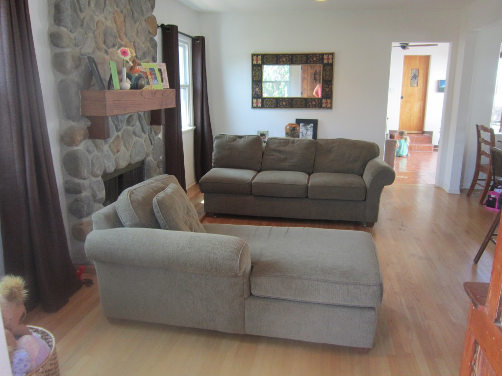
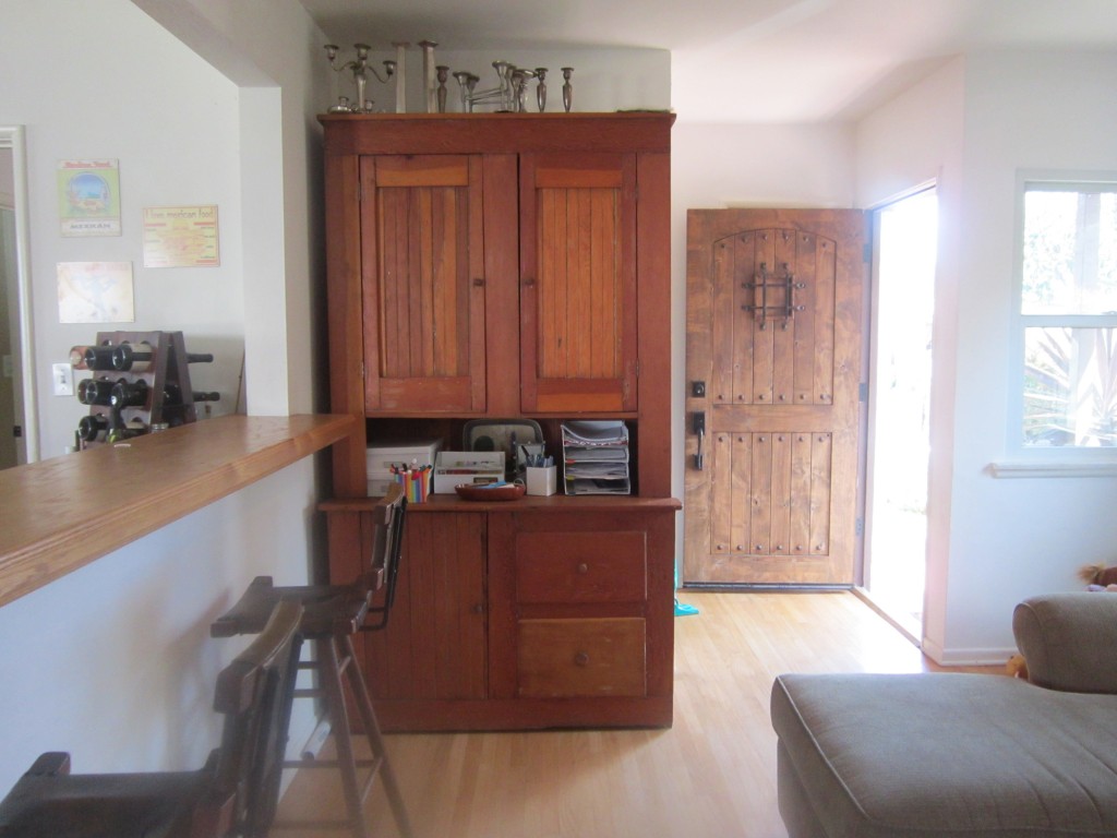
Yesterday, we laid out our inspiration for a California reader’s Spanish Colonial inspired living room. Here’s a reminder of what her living room look like now (there are a few other pics in yesterday’s post):


As we created our design we wanted to make sure we stuck to the essence of Spanish Colonial, but gave it a contemporary, casual twist for this fun family. We wanted everything to feel relaxed and comfortable and be very easy to translate to their space. Lots of explanation below (we like to get you inside our heads!) but in the board below, we’ve outlined designs for the two areas pictured above–her main living area and a wall just around the corner of her entry way. As mentioned yesterday, the hutch would move from its current wall to the far living room wall where the mirror currently hangs thereby freeing up a space close to the front door where the family could have a rustic wood/steel console table with a bowl for keys, mail, etc. A bright red starburst mirror would add an element of surprise and help expand the room, while two leather-topped x-benches could be stored below and pulled out for extra seating in the living room.
If you read yesterday’s post, you’ll see quickly how the inspiration pictures translate to Melissa’s living room design. First, we’d do an overall neutral palette–a paint like Benjamin Moore’s Manchester Tan for the walls and simple cotton drapes on wrought iron rods. For the drapes, we also recommend that Melissa hang them about half a foot higher than her current ones which would balance out the height of the fireplace. The wrought iron would then be brought over the fireplace as a screen leaning against the mantel–this breaks up all the stone. (They can move the small frames currently on the mantel to the hutch–we’d recommend using bright, graphic moroccan style picture frames like these from Haymarket Designs that would complement the bold rug that we’ve recommended in the design.
Speaking of the rug, we love this one because it reminds us of a tiled floor. Because Melissa has kids, it’s also practical (dark color!) and is a fun way to punch up the color in the room given the neutral furnishings. For the furnisher, we’d suggest an eclectic mix–an square-armed, skirted upholstered sofa is balanced by two rounded rattan chairs and a rustic trunk serves as a coffee table (perfect for a storage of toys too.) Yes, the chairs are more Scandinavian, but to make the room feel collected and avoid that catalogy feeling, you don’t have to stick to all one design style as long as it complements the rest of the room. Pillows are a great way to tie the colors of the room all together–bringing in bright shades of red and blue. Finally, an arc lamp modernizes the space and balances the height of the hutch on the other side of the room.
Hope you enjoyed our latest design–let us know what you think! And don’t forget if you click on the small images above, you can source all the items.


FABULOUS!!!!!!!!!!!!!!!!!!!!!!!!!!!!!!!
This makes me smile. I love the bright rug and the chairs are too cool! I’ll pass along pictures once I begin to change things up!