I’ve suddenly been spending a lot of time in my guest room thanks to a two-year old with a cold and a penchant for waking up at 3 a.m. When curling up on that sheepskin rug and hoping she goes back to sleep doesn’t work, off we go to the guest room. So last night I’m lying there trying to coax Madeleine to go to stop moving and go back to sleep and I realize the room feels really bare. I’ve been thinking of getting a bed or headboard in the room for a while, but frankly haven’t wanted to spend a lot of money. But, when I woke up this morning I had the perfect solution (lying awake for hours on end rubbing a baby’s back will give you some thinking time)–a screen Amy had bought for the new nursery that she didn’t end up liking!
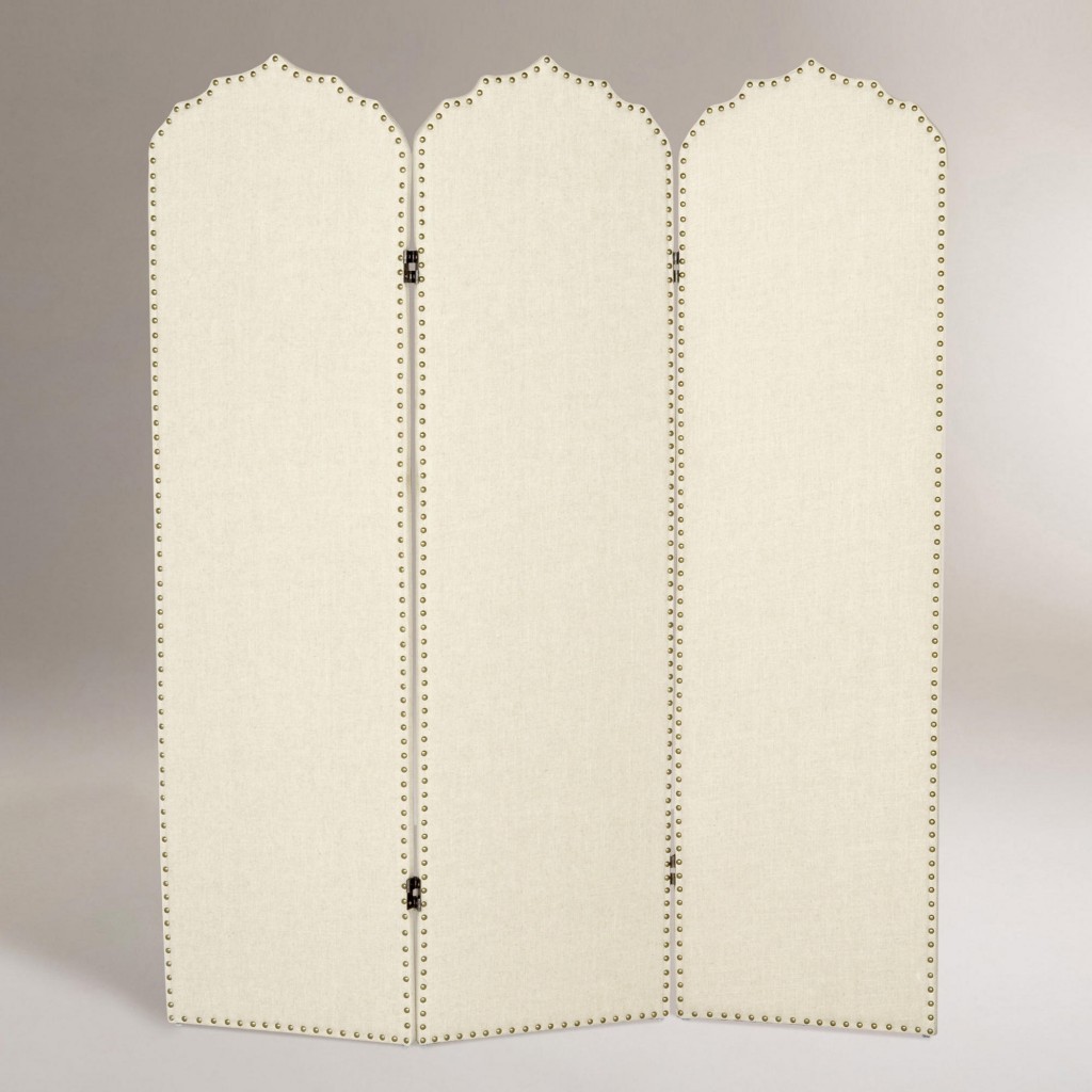
Back in February when she was planning her nursery, Amy saw this post on blogger Bryn Alexandra’s site. She was inspired to use this screen from World Market as an interesting backdrop to the crib:

But, once William was born and Amy knew she had a boy, she’s been gradually changing up the room (we’ll be sure to give you a full view soon!) and the screen just didn’t work anymore. Since we swap things back and forth all the time anyway, I drove over the Amy’s, picked up the screen and by this afternoon I had a completely new look for my guest room and Amy doesn’t have to sell this on Craig’s List! Such a great option for an inexpensive headboard!
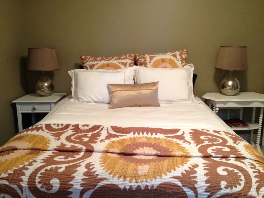
Here’s what the room looked like on Sunday morning

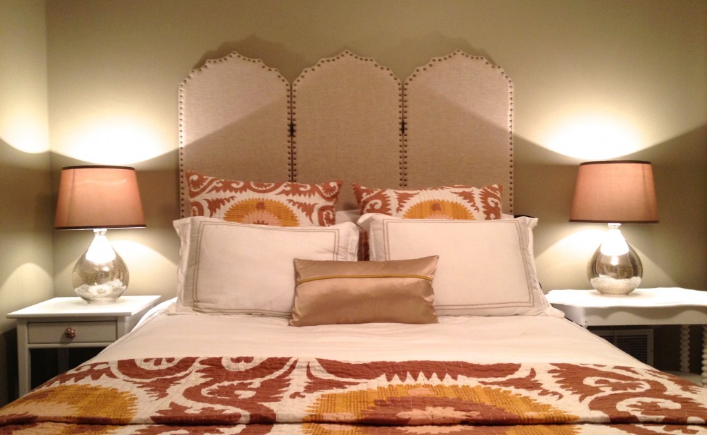
And, here’s what it looks like now

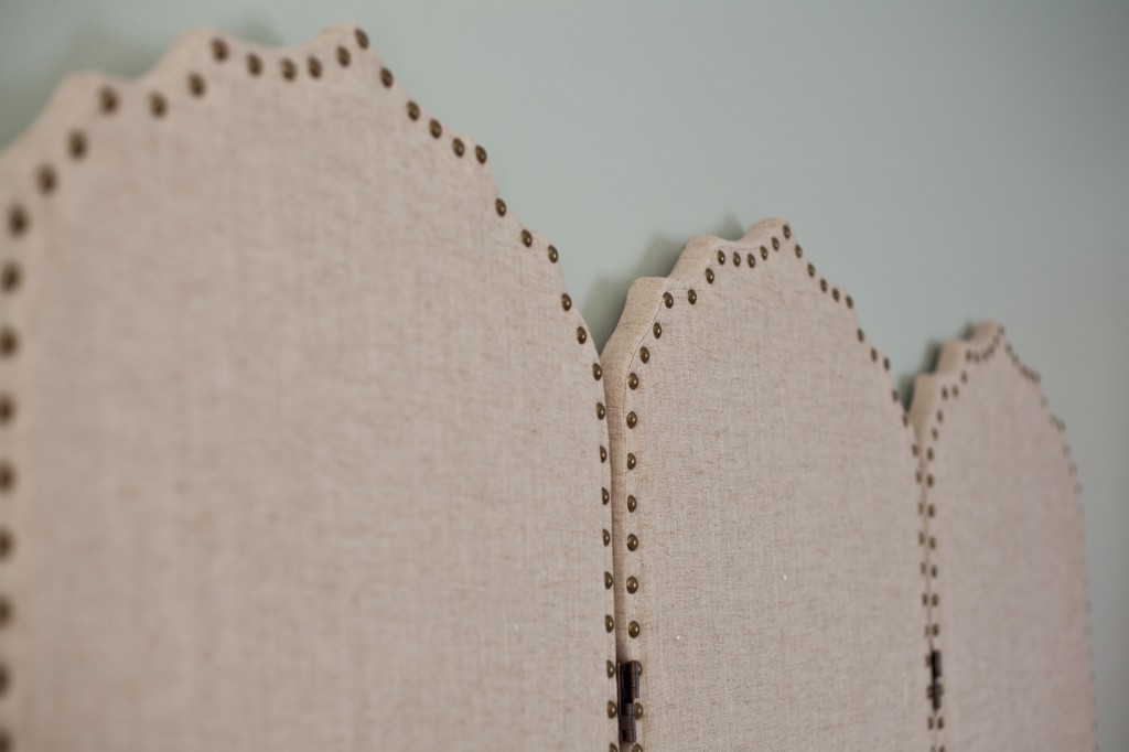
Here’s a close up of the upholstery and nailhead–as you can see, the color is different that the product shot off World Market’s website.

This mattress is a queen and the screen fits perfectly across. BTW, the mirrored lamps and silk shades are also from World Market; the white duvet cover and shams are from Land’s End; the Suzani-style euro shams and coverlet are from Z Gallerie (they were found last spring on the 75% off rack so doubtful they’re anywhere to be found now!); the small throw pillow is from West Elm.


Love it!! The screen as a headboard reminds me of Nate Berkus’ bed which is featured in this month’s Architectural Digest (his is a tan/orange leather with nailhead trim like yours). Great minds think alike!
so cute. wish you would come visit. my house AND my wardrobe need a makeover. 🙂 oh, and i miss you too of course.
Looks fabulous Tessa!! Really great! Makes such a statement.
I love it! Tess, where is the smaller side table from? I need somwthing like that…
The small side table is a hand-me-down that I just spray painted white and added a new knob to (also from World Market actually!)
Looks inviting enough to ask if you take guests?
nice tester!!!
LOVE! That’s a clever use of the screen.