Our friend Grace is expecting a baby girl–such exciting news after living in boy world for the last five years with her twin boys. She is so ready to come over to the pink side and asked us for help designing a nursery that screams all girl!
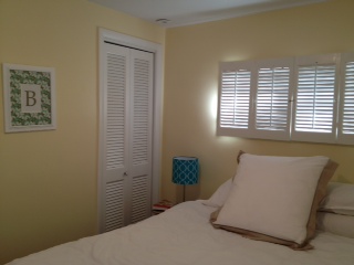
As you can see, it’s a small room with some interesting architectural features that we have to work around. On one side, there’s a high, long window with plantation shutters.
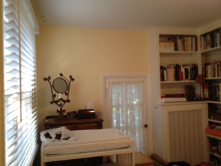
On the other side of the room, there is a small door that leads out to a balcony that they access once a year. There are also built-in bookshelves above a radiator. The door to enter the room is next to other side of the bookshelves.
Grace outlined a few must-haves:
1) She wants a pink palette, but is open to wall colors other than yellow or gray.
2) Grace likes traditional decor–nothing too trendy.
3) She has already purchased the rug for the room so would like us to create our plan around the rug (it’s pink of course!). She also has a plain white crib she’ll use and would like us to incorporate two other things into our design: a diaper changing table and a glider.
4) Because Grace wants to put this nursery together quickly and without a lot of hassle, she would like us to pick things that can be purchased at local stores, in case it doesn’t work out.
On to our inspiration shots…
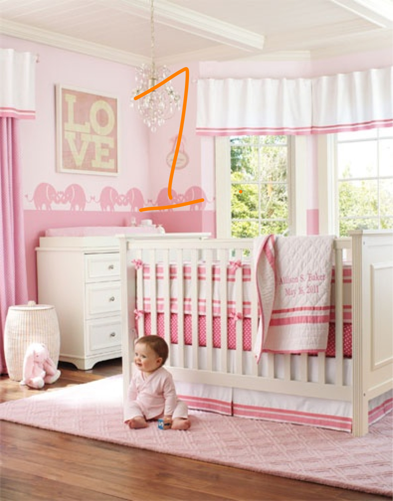
1. Grace is so ready to enter the world of pink (in case you didn’t get that!) While, we don’t want to go overboard, we do want to make sure the room has lots of pink but using different shades and not making the entire room wall-to-wall solid pink. This photo was used as inspiration for creating a pink nursery but breaking up the color with blocks of white and using different shades of pink together. We would also recommend bringing in one more complementary accent color to pop against the pink–a green or blue–that will create more interest in the room.
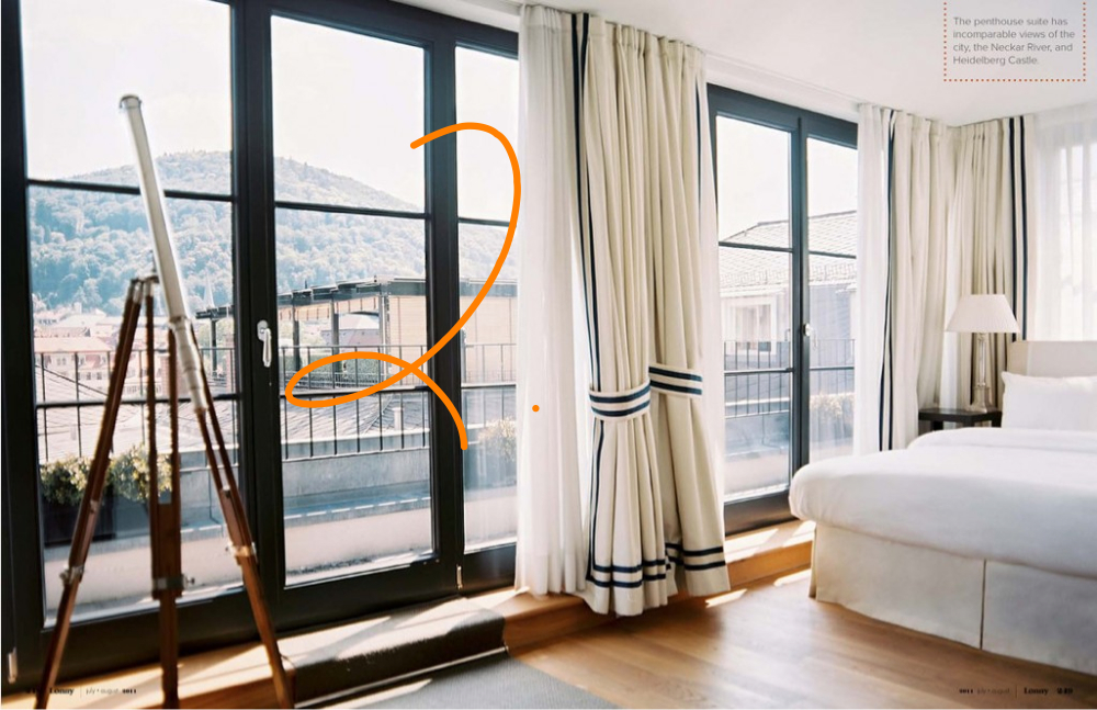
2. We love these simple traditional drapes with a ribbon trim. When looking for inspiration, it’s important to look at all different kinds of rooms. As you’ll see from our photos today, we don’t just look at nursery photos when we’re looking for inspiration for a nursery. A few of the pictures below are examples of that–despite this room not being a nursery, these drapes are exactly the style we are looking for. They are so classic and a look that will never go out of style. We would suggest she pair white drapes with a stripe of pink fabric or ribbon and hang them on a white rod with a glass finial. We would suggest the same window treatments for both the standard window and the smaller rectangular window thereby tying the room together, making it feel more balanced and ultimately making it feel bigger.
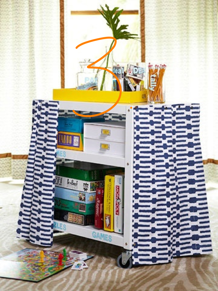
3. The current changing table she has is an open cart so we like the solution below to bring more interest into the room and hide those baby essentials. Skirting the table in a bold fabric is so easy to do using velcro strips!
4. We mentioned the room has a door that goes out to a patio–they only access this door about once a year. It makes the room feel smaller because the door is so low and your eyes instantly go down, plus it lets a lot of light in which isn’t always great with a newborn! We debated a lot about a solution for this, but after seeing the picture below, it triggered a clever thought…why don’t we create a large fabric bulletin board to hang over the door all the way to the ceiling? The board could be custom made using a large stretched canvas to allow for the depth of the doorknob and would just hang over the door making it easy to take down on the few occasions they need to access the door.
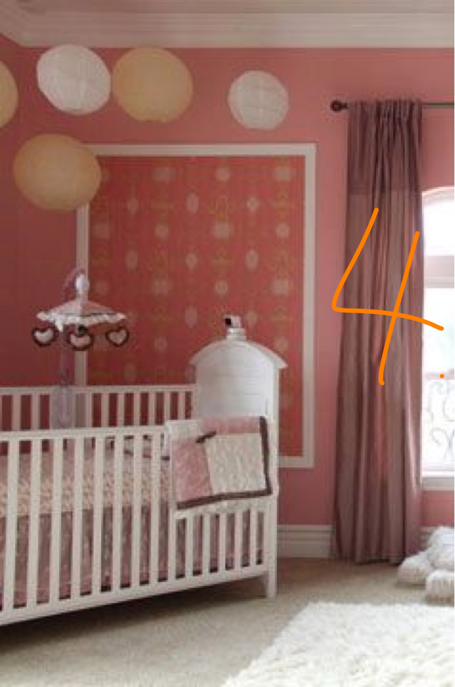
Here is one example of how she could adhere ribbon to the front of the board to secure photos and momentos.
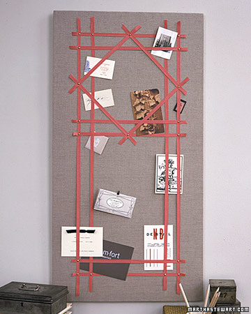
5. For the bookshelves, we’d stick with the pink theme, but recommend painting the backs of the shelves a brighter pink to provide depth to the room. This would give these bookshelves an instant update and would make the items on display pop.
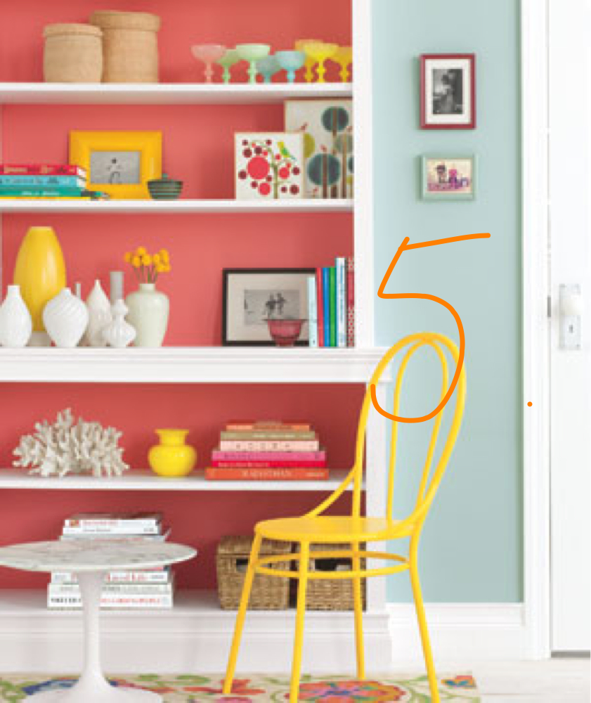
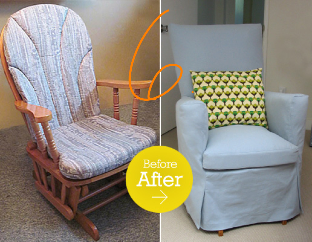
6. Finally, Grace has inherited a glider she would like to use in the room. We love the idea of having a chair cover made to instantly update the glider–plus, this would be a more affordable alternative to new upholstery.
Tomorrow, we’ll show you how we put together a design board for Grace. One guarantee–there will be pink!


One comment on “Inspiration for a Reader’s Nursery Design”