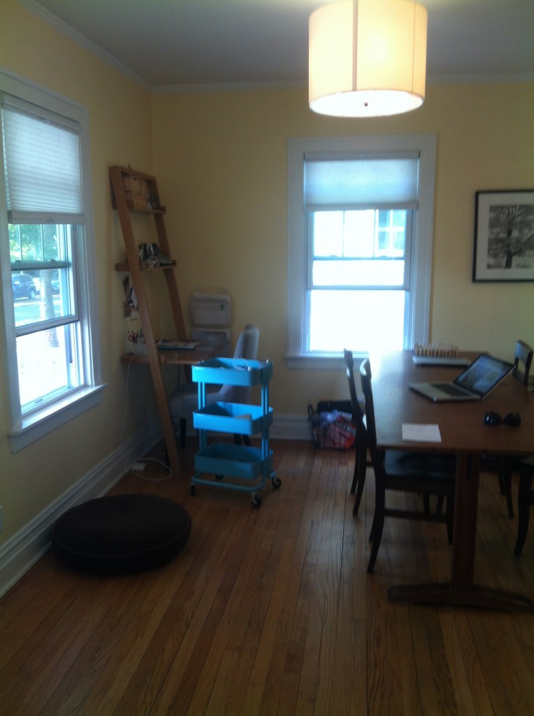
Julie contacted us for help making over her office space that lives in her dining room. It’s her favorite room in the house to work in, but her husband hates how she has her desk set up against one of the walls so she’s asking for a solution that is more attractive. Since this is the first room you walk into in the house, Julie and her husband want to make sure that it’s inviting and doesn’t feel like you’re walking into an office.
Here’s a picture of the room as it currently is

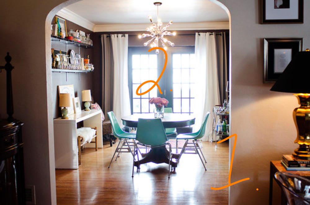
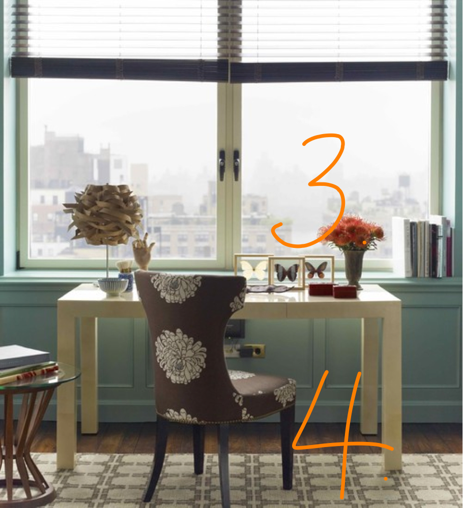
Julie isn’t married to any of the furniture in the room, although she does want to keep the yellow walls. We knew we didn’t want a typical desk in the office so as we were looking for inspiration shots, we had to think a little differently. Here’s where we ended up…

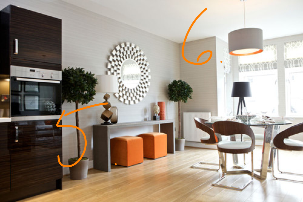
5. Two storage ottomans would serve as a place to put office supplies and as a pop of color in an otherwise neutral palette. They would slide under the console when Julie isn’t working. They would also also serve as extra seating in the adjacent living room if needed.
6. There’s also limited lighting in the room, so we’d do a light over the table and lamps on the side console–lighting at different levels is a MUST in any room!


So far I love everything, I can’t wait to see what’s coming up!