Thom Filicia is one of my favorite designers. I just love his kind of “American with a twist” approach to design. He has such a clean, masculine feel about his rooms and I love how he keeps things relatively neutral when it comes to color, but always plays with texture and scale to create amazing spaces.
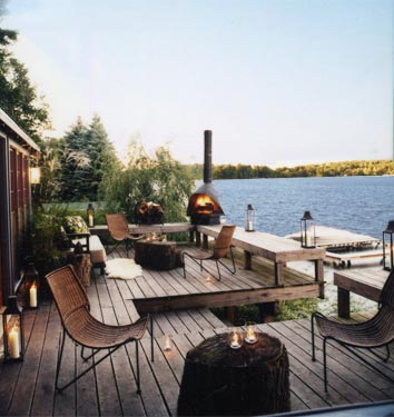
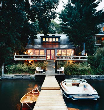
In 2009, (in my former life as a PR girl!) I was lucky enough to work with him on a client project where he redesigned the dressing rooms at The View. LOTS of work, but such a fun project to work on! He had just come out with his book “Thom Filicia Style” which features lots of pics of his upstate NY lake house-it was also featured in a 2008 issue of Domino- and I totally fell in love with the comfortable, cabiny home.
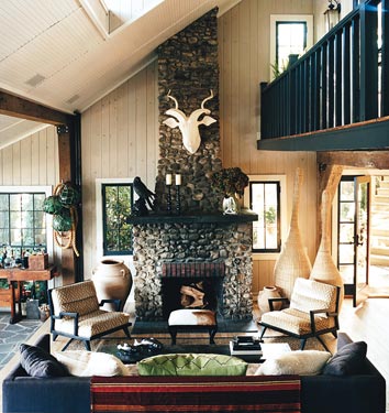
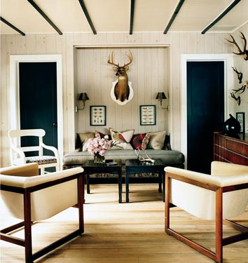
This great room is a perfect example of how Thom plays with scale
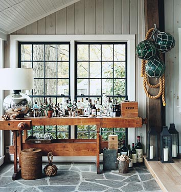
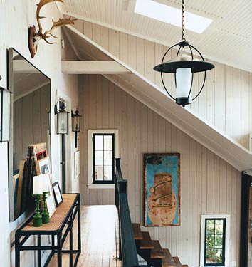
One of our clients has an amazing carpenter’s table like this one-perfect as a bar in a country home
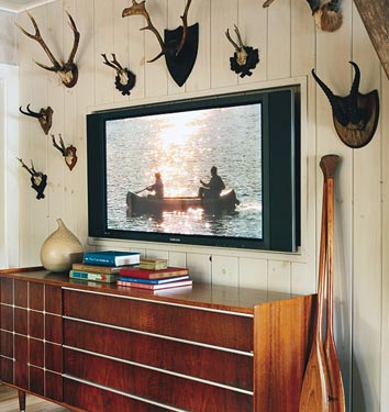
I love all the wood paneling throughout the home. I remember asking him what color and he said it’s actually a soft grey. I used these photos to convince my parents to paint all the pine paneling throughout their summer house in Nova Scotia! After four years of bugging them, they finally did it this past summer!
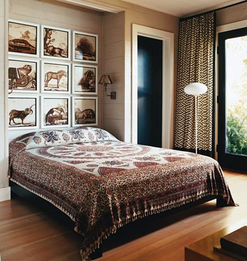
Another clever way to create the look of a headboard
Amazing right? BTW, Thom has since moved to a new lake house which you can see here from House Beautiful. Also, Thom Filicia Style has been around for a while so it’s really cheap on Amazon–if you don’t have it, it’s a great one for your library!

