A reader in Northern California contacted us a few weeks ago to help get her entry in shape for holiday entertaining. She was looking for some ideas to create a warm, inviting space that worked with their existing paint color of Benjamin Moore Louisburg Green and would also provide function for the family. Specifically, they were looking for an area to hang coats, place shoes and throw down mail, keys, etc.
To give this family some options, we decided to create three set ups that follow the same basic formula. but execute it in different ways. Our key components were: a durable area rug, hooks for coats, storage for shoes, an umbrella stand for those rainy San Francisco days and an entry table with a lamp and mirror and storage ottomans below to provide seating (always remember to have a place for people to sit and take their shoes on and off!) In each case, we used a relatively monochromatic palette (monochromatic doesn’t have to mean boring!) but used a mixture of textures to keep things interesting.
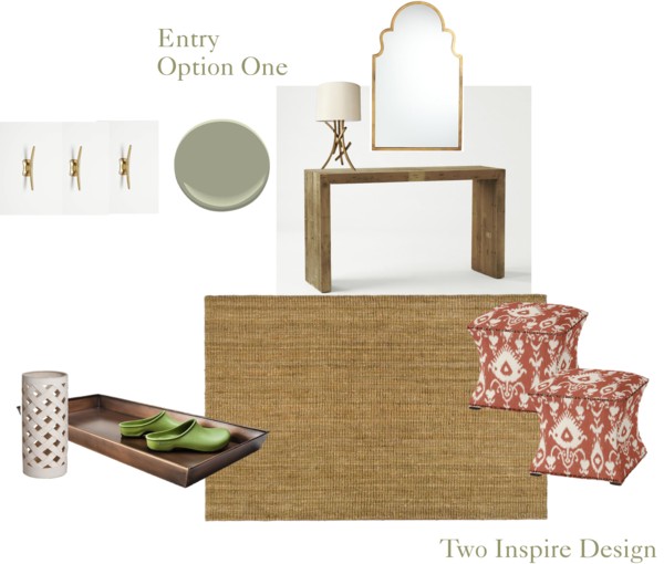
Option One: Warm reds and browns play off brass accents. The lamp is the client’s existing entry lamp so we wanted to reuse it. Sisal is perfect for an entry because it hides dirt and takes a beating. A rustic wood console plays up the natural California setting, but a gilt mirror adds a little formality. Two ikat-patterned ottomans provide seating and extra storage (perfect to throw in little kids’ shoes) while a boot try and ceramic umbrella stand are practical.
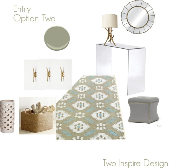
Option Two: In this second option, we continued using the brass accents, but brought in more cool colors with a little grey and blue which plays off the green walls nicely. In this case, we suggested a large basket to store shoes because we wanted to create contrast to the sleek glass console. For coat storage we again used these amazing Streamline Hooks to complement their existing table lamp–I’m obsessed with these hooks!
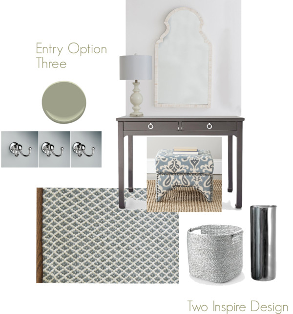
Option Three: For this one, we took the palette even cooler. A grey desk serves as a console with a white bone mirror above and in this case we offered up a different lamp in order to bring in chrome accents rather than brass–while we’re big fans of mixing metals, in this case, we wanted to go for a more uniform look. A pretty indoor/outdoor rug in a tight pattern adds interest and coordinates with a storage ottoman in a bold print.
Which would you go with?


they’re all fabulous! In contrast to Stephanie, I think I like #1 and #2 the best! love that lamp and those hooks. and I LOVE LOVE LOVE that console table you used in #1.
I love them all! I especially like #3 — that gray Jonathan Adler console is perfection! Completely agree about the gold hooks — so gorgeous with the lamp… Nice job — let us know which they decide to do!