California Home & Design magazine is to me like House and Home Canadian magazine is to Tessa. I guess each magazine makes us both feel a little bit at home (I’m not orginally from California but I tend to think of it as my home since I lived there for so long) when looking at the newest issue.
What I love about California Home & Design is they often feature incredible homes that are very family friendly and actually practical. In their pages you’ll find things not too far off from reality and usually spaces that I could see myself moving right into and not changing a thing. The December issue (I’m a little behind in my reading thanks to a five month old who doesn’t sleep) did not disappoint and designer Catherine & Brian Kwong got it spot on. Their home is described as rustic meets modern and I couldn’t agree more.
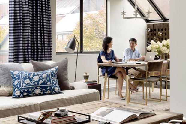
I’m loving those beautiful striped drapes. I’m always intimidated by patterned drapes but I could definitely get use to seeing these in my living room.
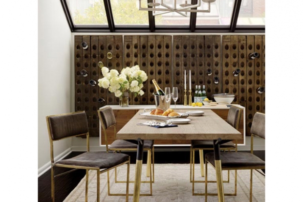
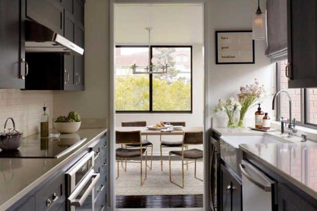
I love this rustic wine rack but what really makes me go gaga are those awesome dining room chairs recovered in a plush velvet and then paired with a traditional rug. The table seemed too ordinary to Catherine so she had the legs painted a gold leaf to match the legs of the chairs-brilliant idea!
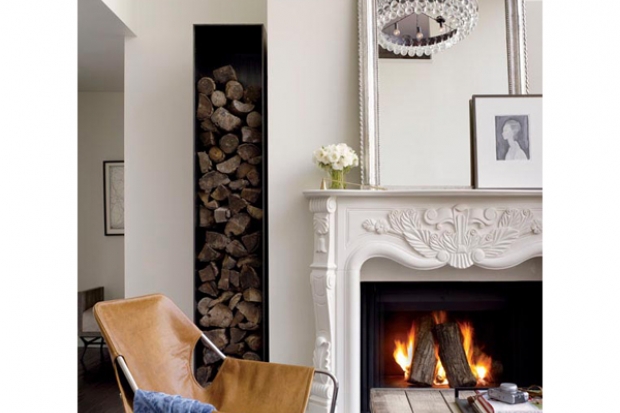
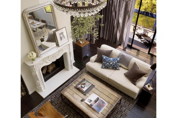
I don’t know what to comment on first…the incredible firewood container or the beautiful fireplace mantel? I love the classic fireplace mantle and then how they purposely placed a steel modern container right next to such a traditional feature.
This photos makes me want to re-think painting my kitchen cupboards white.
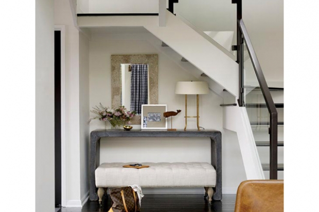
Love how she turned this otherwise empty space into a focal point and made it make sense. An upholstered bench under a key drop table is another way to add softness and another layer to the space.
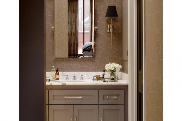
This bathroom is pretty much perfection in my eyes. Once again, loving the dark painted cabinets and the added touches of the crystal pulls and knobs.
An awesome view of the drapes, mantel decor (simple but purposeful), rustic coffee table, linen couch with velvet pillows, a perfect mix of rustic and classic decor, and it’s all pulled together by a gorgeous rug.
Of course I say it’s gorgeous because I have the same rug in my living room!
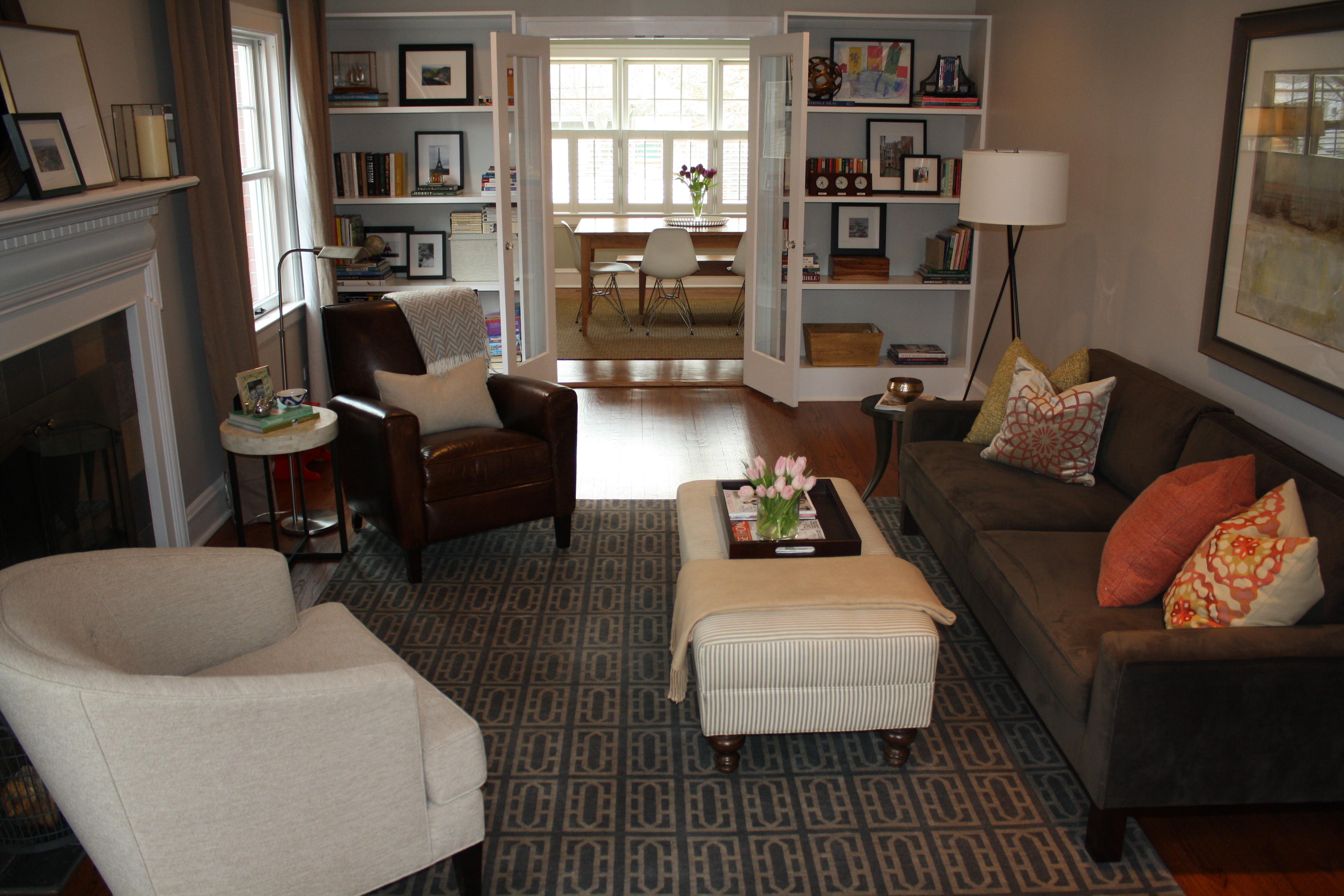
I loved this rug when I first saw it two years ago at Room & Board and although it was a bit of an investment, I knew it would be the right rug to pull the whole room together. I’ve learned through my own decorating experiences that purchasing something you LOVE always works in your space and is the most important factor when bringing items into your home. My decor style has changed over the years (Tessa can testify having seen our flat in London that was decorated Pottery Barn from ceiling to floor) and choosing this rug has lent itself to incorporate all of my styles: rustic, modern and traditional decor in my home. And finally, after seeing her home with the beautiful blue curtains I think I need to add a pop of color or pattern to my drapes, agree?


One comment on “California Home & Design: Rustic Meets Modern”