Our first post! We are so excited to have finally started this blog. For years, interior design has consumed many of our conversations so we thought it would be fun to share images from which we take inspiration, highlight our trusted resources, provide a glimpse into our own homes and the homes of others, and jot down our many random thoughts about design.
We talked a lot about what we wanted our first post to be (so much pressure!) but in the end decided we’d let you get to know us more by challenging ourselves to each pick one image that sums up our design aesthetic and has served as inspiration in our own home. If you’re reading this blog, you either love one of us (you know who you are!) or you’re just like the two of us–spare moments are spent pouring through magazines, books and the internet looking for inspiration to switch something up or add a little something special to your home. Having looked at thousands of images, it’s hard to pick just one, but let’s give it a shot…
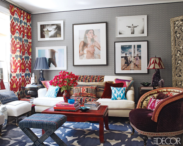
Tessa’s Choice: I ripped this image out of the December 2010 issue of Elle Décor and immediately stuck it on my bulletin board. The living room of São Paulo–based designer Sig Bergamin’s Manhattan apartment is perfection in its lack of perfection. I love that you can tell a lot about the person who lives in this home—Bergamin’s personality is evident in things like the Brazilian photography and favorite books on display and it feels like each piece was lovingly collected over years. I also admire the ethnic vibe of the room and intense use of color and pattern which contributes to the layered feeling.

Amy’s Choice: I recently came across this photo on one of the many blogs I read every morning. I quickly went to the source to find other amazing rooms with plenty of inspiration. This living room gives me such a peaceful feeling. I love the clean lines, pop of color, unexpected light fixture and the beautiful floor to ceiling windows that become such a focal point of the room. The soft colored gray walls instantly allow for more pattern in the room without making it feel too busy. I also think this is a great example of a room that has matching pillows, chairs and lamps but the mixture of patterns keeps it interesting and not feeling too matchy-matchy.

We hope you enjoy reading and learning along with us, and please get in touch if you have any thoughts to share.


Amy I can’t believe you posted my living room photo without telling me! Just kidding love it and WISH it was my living room.
All lovely designs!! What a pleasure to see!
All lovely to look at! Great designs!!
I remember your creative teaching style Amy…so this is another great way for you to share your creativity. Congratulations to you and Tessa. I will look forward to reading your blog!
Wow! Love it. Can’t wait to follow the blog. Congratulations! Amy, get me that lamp….
This was awesome congratulations on your new adventure! I can’t wait to check in and read more great ideas!
Tessa,
This is great! I pulled that page out of an Elle magazine because of the carpet and the Ikat printed drapes – it is beautiful.
Congratulations on pulling this off.
Anne
Congrats on launching your blog! GREAT timing cuz we just bought a house pre-construction and we’re in total interior design brainstorming mode now – have a few months till our house is ready. Will be checking in regularly for ideas and inspiration! xo
Glad to see you got your blog started. Love it! Congratulations!
Great blog! I need some tips-can’t wait to read more…
A million CONGRATS to you both! Great blog design and first post — really excited to see what is to come! xxx
I love both of your room choices and totally see you reflected in each of them! I really like the subtle texture in the wallpaper of the first room, and the soft gray walls in the second room with that chunky white trim is so fabulous. Can’t wait for Tessa to visit in a few weeks and give me some good design ideas! xoxox
Congratulations on your first (fantastic!) post! Can’t wait to read more. 🙂 Cheers!
Love the new blog! So excited to read it!