A friend of ours in California, Carrie (we talked about her in Tessa’s posts about her trip to California) asked us to help figure out what to do with her master bedroom. She recently added on a phenomenal second floor addition that is a master retreat–bedroom, dual walk-in closets, bathroom and laundry room. She and her husband love having their own space and now want to make it feel really special.
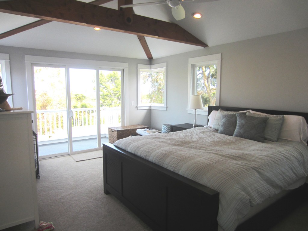
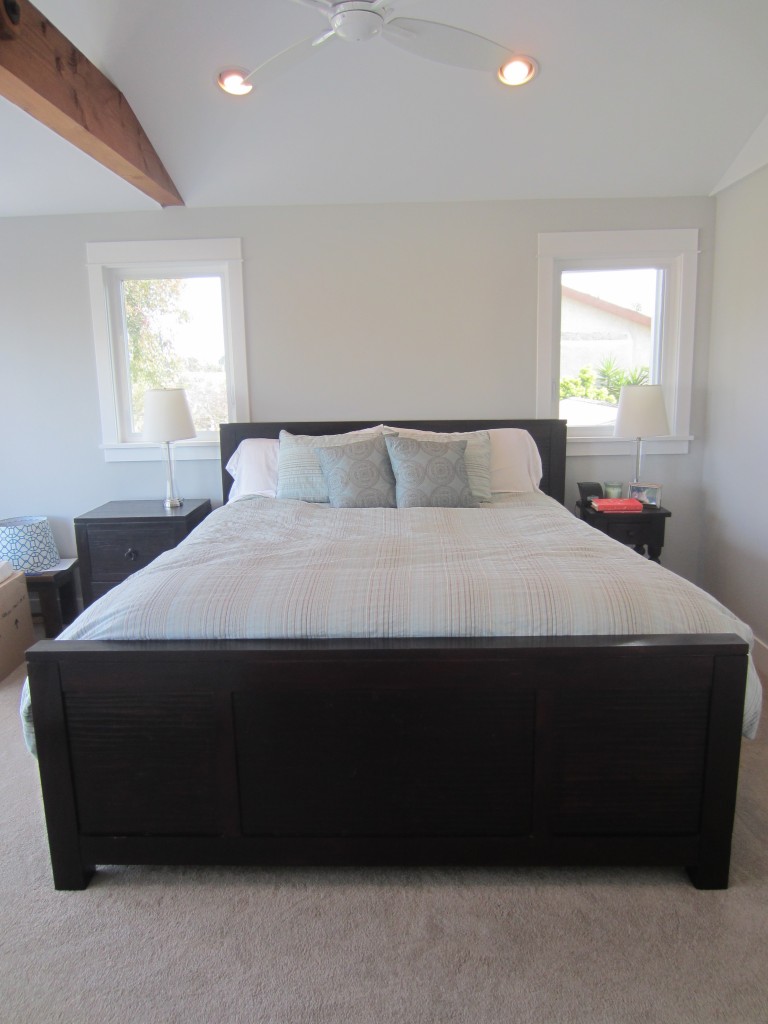
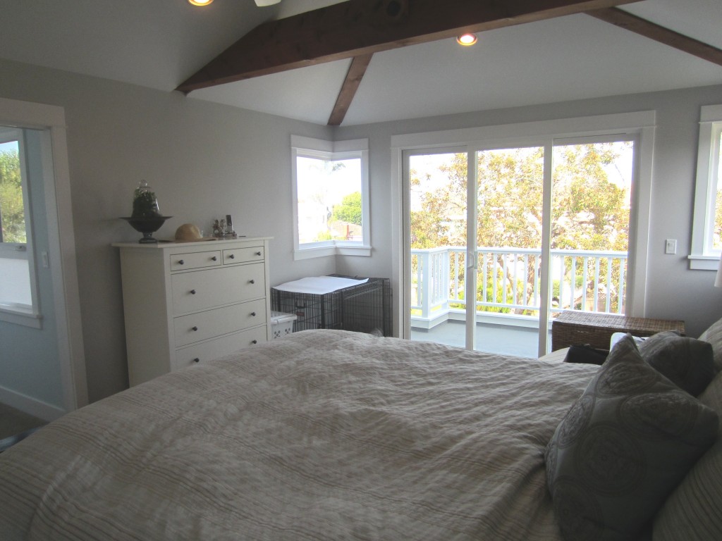
Carrie gave us some guidance for her new bedroom’s decor:
- Make sure the colors flow with the rest of the house that is decorated in a cool palette of white, light grey and pale blue;
- The only piece of furniture that needs to stay is the bed;
- Because of the window moldings, has to do drapes on the large glass doors;
- Would love to see a mirror;
- The dog crate will no longer be there!
- And, finally, wants to make sure to tie in the beams somehow.
Amy’s Perspective
I love Carrie’s high ceiling and the generous amount of natural light that shines through her bedroom. When I think of Carrie’s style, I instantly think of designer Sarah Richardson. I used two photos from Sarah’s portfolio for inspiration in creating her room that I’m calling ‘Casual Hollywood Glam’. This is exactly the same style I have in my bedroom so this was a fun project for me.
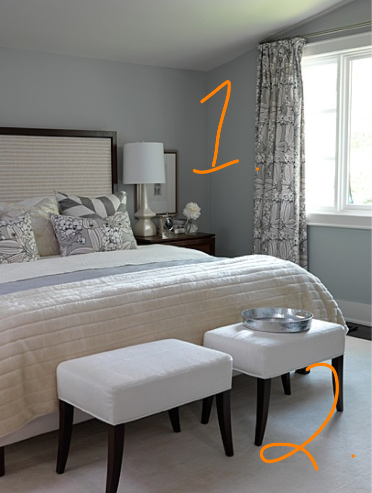
1. I used this photo for inspiration on color and fabric in the room. I would, however, switch things up by instead using the repetitive print of the curtains as inspiration for Carrie’s duvet, keeping pattern to the bed rather than the drapes to help soften the dark headboard.
2. I would add two small footstools to the end of the bed. I like the idea of two instead of another long solid piece of furniture in the room.
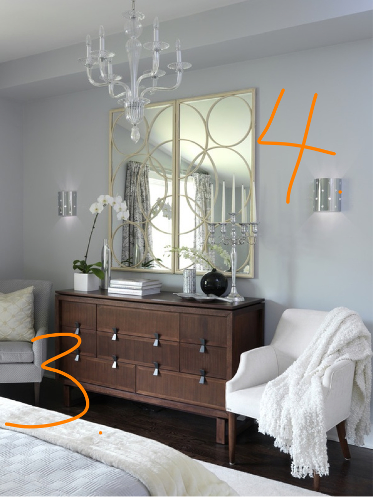
3. I would put a long, low dresser in a dark wood with a clean, mid-century feel. These dressers are often available on Craigslist and can be refinished or painted for half the cost of a new one in stores. The wood would balance the weight of the bed.
4. I would also put a large mirror above the dresser to add even more height and bounce the light around from the windows on the opposite wall.
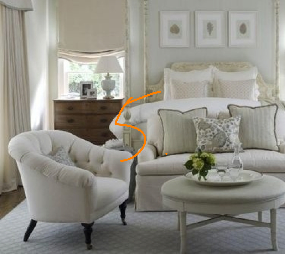
5. I love this barrel back chair and think it would look great in a bedroom. The scale of the chair needs to be relatively small because it would go underneath the corner window in her room. Carrie could then she pull up one of the footstools at the end of the bed to create a cozy reading area.
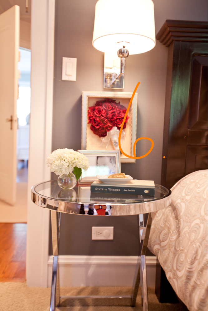
6. I love the idea of a modern glass table to be used as a nightstand. The shiny table next to a dark headboard (which Carrie currently has in her room) is the perfect juxtaposition. This photo is actually from my master bedroom. And yes, that is the bouquet from my wedding. What can I say, I can be a little cheesy at times.
Tessa’s Perspective
For this project, I wanted to blend femininity and masculinity so both Carrie and her husband, Greg, will be happy in the room. They love the beach so I thought it would be fun to bring that palette into their bedroom. As we mentioned, Carrie wanted to room to have the light, cool colors of the rest of her house, but I’d like her up the ante a little by bringing in deeper shades of the blue/gray colors she loves and adding in a little caramely brown–this will create more depth to the room. I also want to add a lot of texture. I’m calling this style ‘Beach Ethnic Twist.’
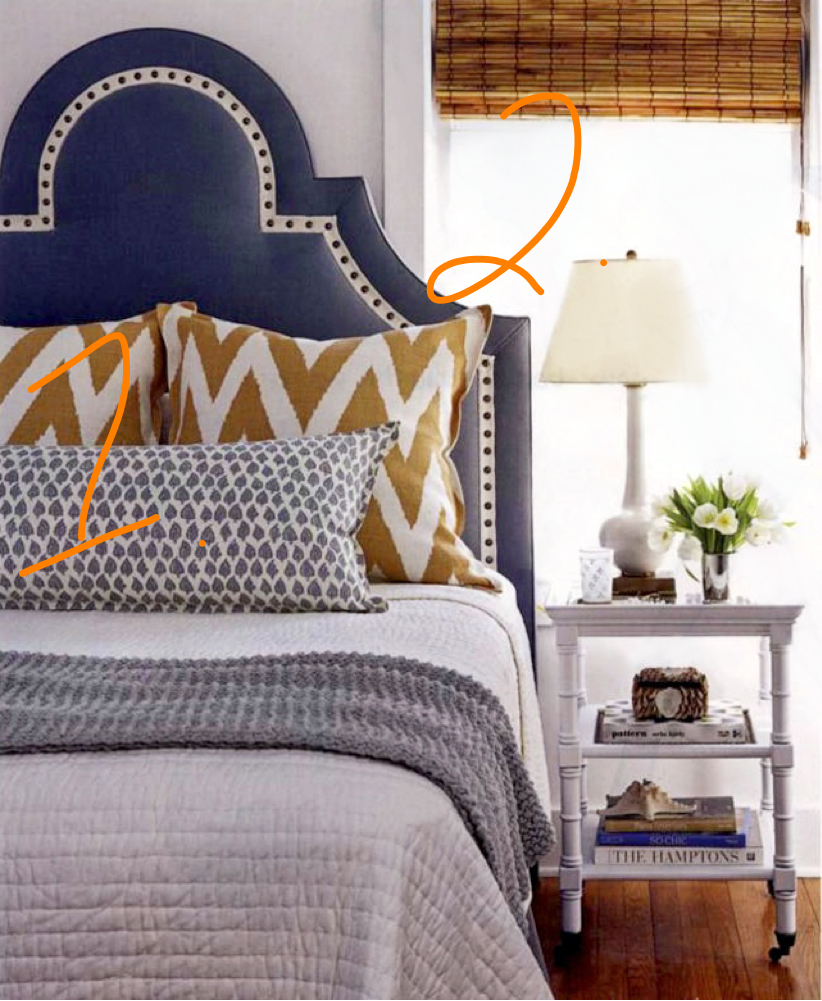
1. This picture really brings to life my idea of Beach Ethnic Twist–it reminds me of an exotic beach at sunset when all colors just seem richer (I know it sounds cheesy, but it’s true!): the deep blue of the headboard is like the ocean, while the chevron fabric (Quadrille Tashkent) is reminiscent of the sand against the blue/greys and whites of the bedding and furniture. My suggestion for Carrie is to keep her bedding relatively simple in the blues/grays she loves with just a pop of pattern and color.
2. Natural woman shades automatically add amazing texture to a room. These bamboo shades with orangey brown tones and black undertones would tie together the wood on the bed with the wood color of the beams.
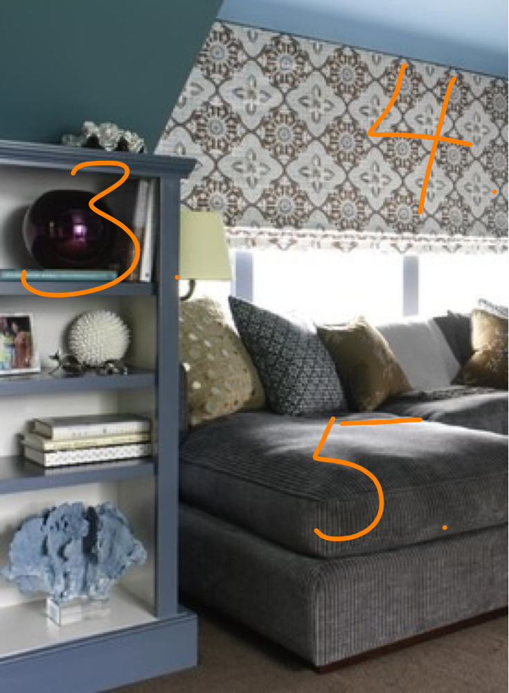
3. Taking inspiration from the painted bookcase, in this room, I would suggest that Carrie find a long dresser that could be affordably refurbished or one custom built by a local store like Hermosa Beach’s Curious. I love the deep blue tone of this piece–since Carrie isn’t replacing her bed, painting the dresser this color would bring in the blue from my first inspiration shot. Remember, you don’t have to copy a picture exactly, you can bring the colors into a room in different ways.
4. I love the idea of bringing in a bold, repetitive print that highlights, but contains the glass doors and pulls all the colors of the room together. Instead of doing a print on my duvet cover like Amy did, I would bring it in on the drapes for the large glass doors.
5. Taking inspiration from the color, not the fabric (too heavy for California living) I’d suggest a comfortable dark grey upholstered chair in the corner next to the bed. This would provide a place for Carrie and Greg to get away. I actually like the idea of a taller chair that would reach just above the bottom of the window–that would help break up all the windows and make the room feel cozier.
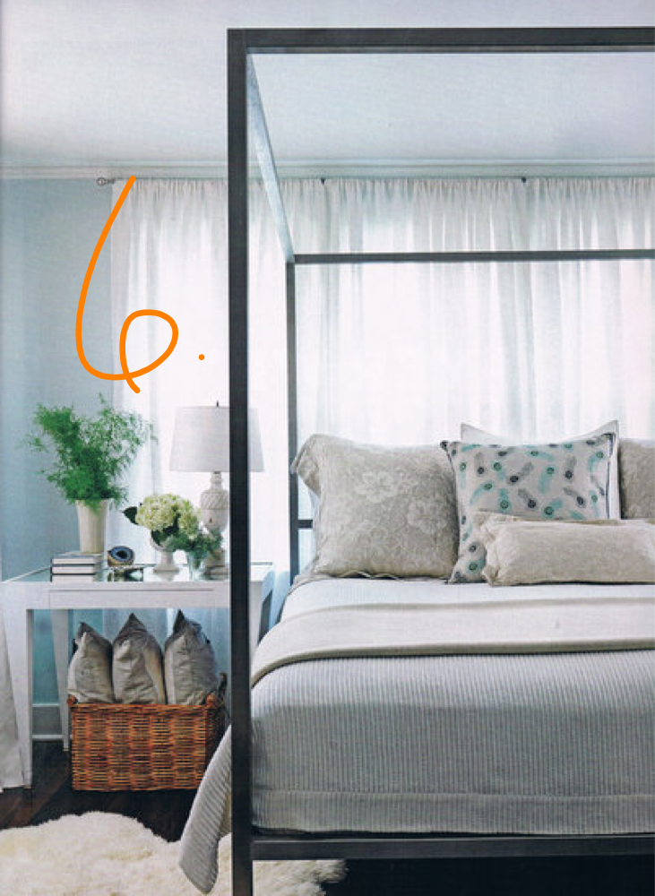
6. White lacquered side tables would contemporize the space and create more interest by juxtaposing the dark wood of the bed. Because the bed is really heavy, I like the idea of keeping the tables open so that the space feels lighter. I would then put darker accessories on the white tables to tie it to the other elements in the room.
Check back tomorrow for our boards with specific recommendations based on these inspiration shots.


I am looking for a bed just like what’s shown in photo 1/2 (wood trim & fabric). I have a small bedroom and this would be perfect. Can you tell me where you purchased it?
Hi Pat–this was designed by Canadian designer Sarah Richardson. You may want to contact her as I’m not certain where she got it! thanks.
Carrie- what fun! Your place is gorgeous as a blank canvas! Cant wait to see what you decide!
Love Tessa’s taste of blending both…….but apparently I’m selfish because love the classy feel of Amy’s example and would just tell the husband he could have another room!! 🙂 Great job ladies…..your blog is so fun to read!