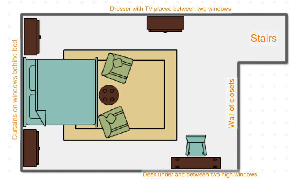
Our second step in tackling our winning reader’s bedroom makeover, was determining Nicole’s furniture layout. We wanted to make sure we addressed the challenges in her room–namely creating a serene space to sleep, relax and work–all around the randomly sized and placed windows. For pictures of the room as it currently is, see yesterday’s post.
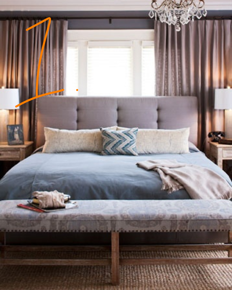
1. First and foremost, placement of the bed–where would the major piece of furniture go? With different sized windows on each wall, there wasn’t exactly a “natural” place for the bed to go. After a lot of discussion, we decided the best place to position the bed is in front of the large window at the end of the room. It’s common to resist putting a bed in front of a window, but like in this inspiration shot, Nicole’s largest window will serve as a great frame for her bed.
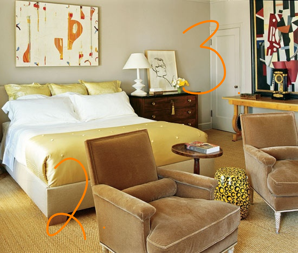
2. We wanted to include a seating area for Nicole so she’d have somewhere to escape to and watch tv. She has a large bedroom so a couple of upholstered chairs are not only functional, but also a great way to fill up and soften the large space. So, at the end of the bed, we’d place two upholstered chairs that would also stop the room from looking like all the furniture is against walls.
3. When working with a large bed like Nicole has, we also like the idea of using small dressers in lieu of traditional bedside tables.
4. Her two new upholstered chairs would be used to watch TV on the same wall it is currently on, except we’d have it on a new dresser that would sit between the two windows. While she has relatively good closet space, a dresser will serve as a great way to store delicates or accessories. We would choose a dresser in dark wood like the bed that she’s keeping and have her mount the TV lower (8-10 inches above the dresser) or just have it sitting on the dresser. Either way, it would be on a swivel so that she can also watch from her bed.
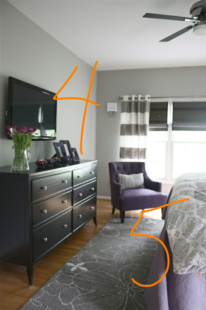
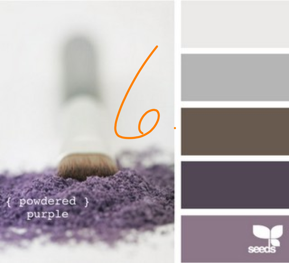
5. This inspiration shot also inspired our color palette for the room. Nicole wanted a room that was a good balance of femininity and masculinity. She also likes a touch of glam which we think the plum/purple family really provides-so regal!
6. We saw this color swatch and were inspired to apply a similar one to Nicole’s room.
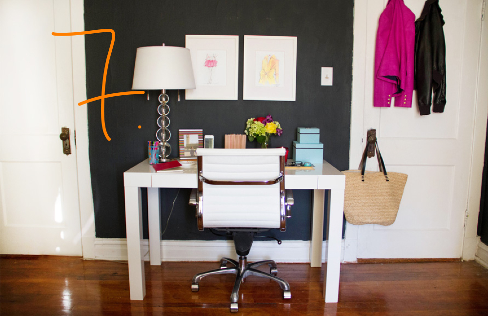
7. On the opposite wall to the dresser/tv, we’d give more purpose to those two awkwardly placed, high windows by putting a desk between them and a mirror or piece of artwork over the desk between the windows. Like in this inspiration shot, a desk between the windows will detract from the windows themselves and a mirror or artwork will provide the balance necessary to make sense of the high windows.
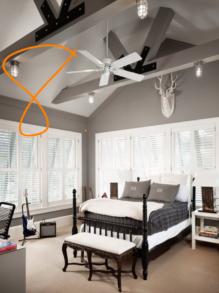
8. Additionally, we’d recommend painting the beams in her bedroom the same color as the walls. Really makes the white ceiling pop.
After taking into consideration all of our inspiration photos, here’s where we landed on the final furniture layout for Nicole’s master retreat (note, this is not to scale, but gives a good idea of where she would be placing furniture):
Tomorrow, we’ll show you how the room layout and color palette came together to create a design board that Nicole can use to create her master retreat.

