
Recently, I’ve been getting Facebook feeds from Canadian magazine Style at Home. Last week, this room caught my eye:
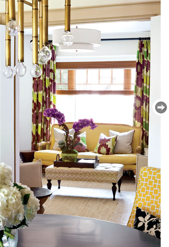
I can’t see all of the light fixture in this shot but I already know I LOVE it. The yellow dining room chairs help blend the two spaces together.
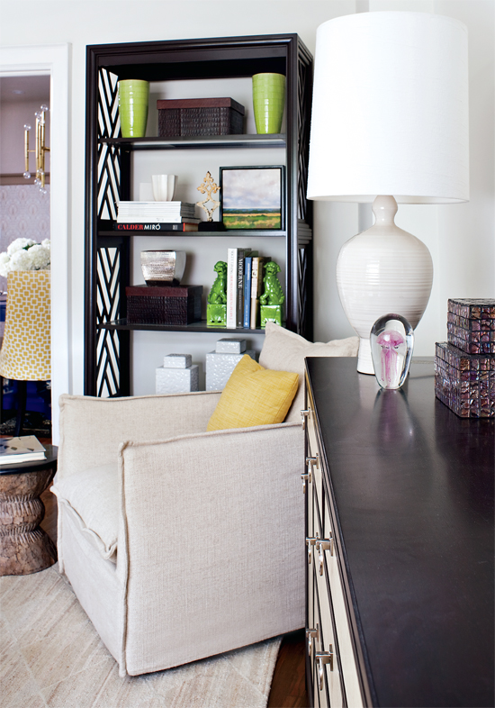
After falling in love with the initial pic, I had to go to the source and see if I could get a few more views of this gorgeous room designed by Feasby & Bleeks Design. Notice the mixture of metals in this room below….this tells me it’s okay to mix silver end tables with gold. I think it works because both tables have the same lines.
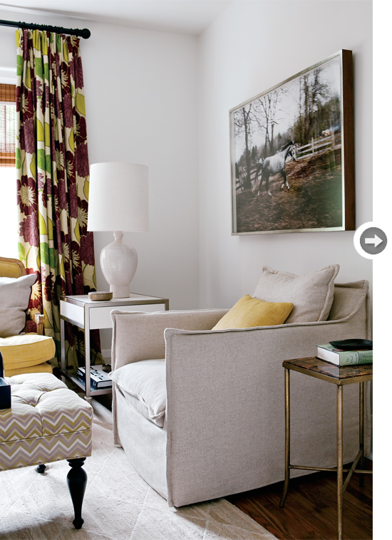
The green vases tie in with the curtains and give the room the right amount of another color without going overboard. Check out the third side table…gotta love that they added a rustic table to the mix. A room is never complete without something rustic.
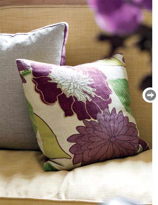
Loving how they played it safe here with two bold pillows from the drapes and then two pillows with a nice linen fabric but the backside is the deep plum.
I think this rooms is a perfect mix of plum and yellow…two colors that I would have never had the nerve to pair together. But, with the right amount of pattern and different elements, it totally works.
Please send more rooms like this my way, Style At Home!


I am looking for this fabric! Do you know the name? Or a source? Thanks!
Hi Allison-I don’t know the name but I will email and see if I can find the name of the fabric.