For Throwback Thursday, thought I’d republish this post that revealed my styled bookshelves. We get asked a LOT about restyling of shelves so thought a little inspiration for a summer project was in order. You can also see the before and afters of my built-ins project here.
…
It’s all well and good to give advice, but the most important part is showing you that our advice is easily applied! As a follow up to yesterday’s post, we wanted to unveil my new, STYLED bookshelves (yippee!.) There was some serious bookshelf philosophizing going on as we tackled these yesterday while our four kids (collectively) wreaked havoc in the basement! LOVE how they turned out –the right balance and mix of art, books and accessories!
Before pic shows a start, but clearly not a good finish
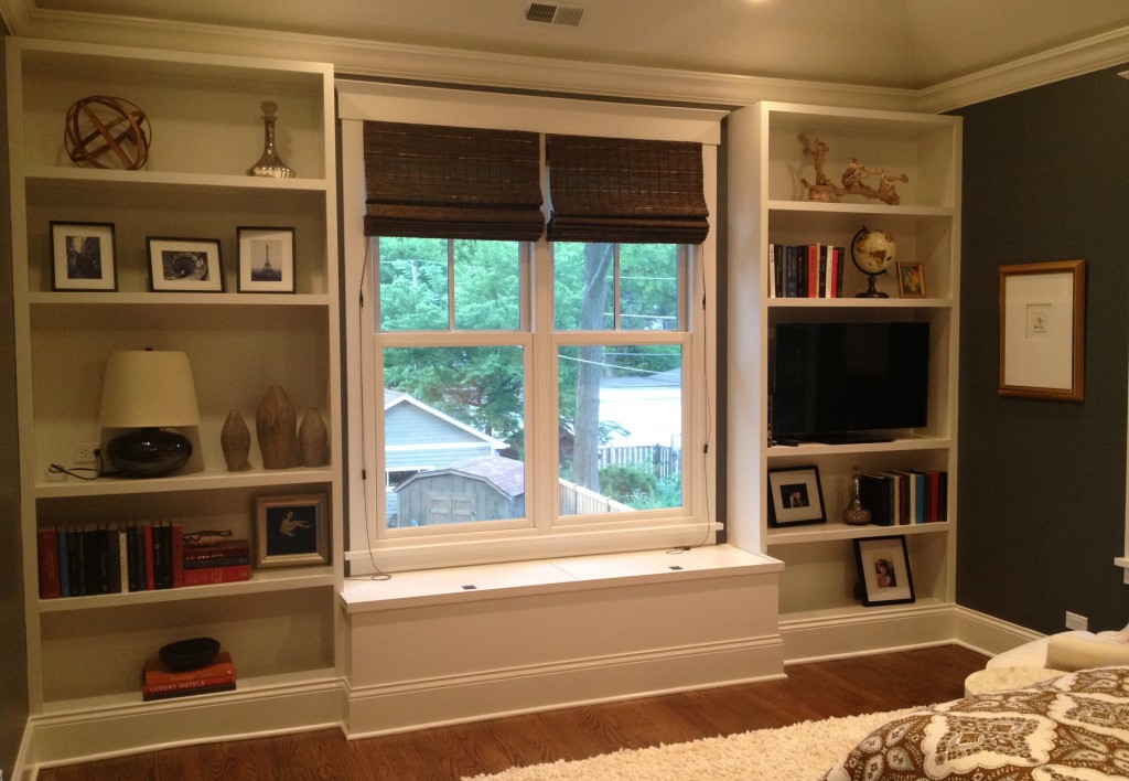
And, the after:
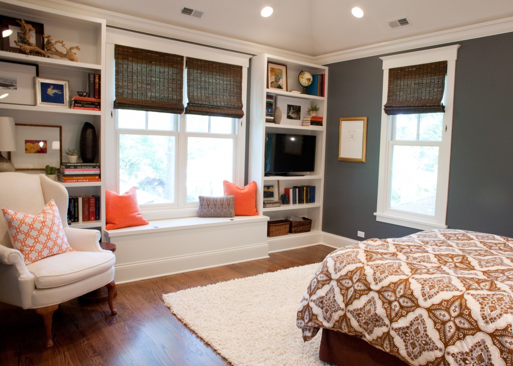
Full view of styled left side:
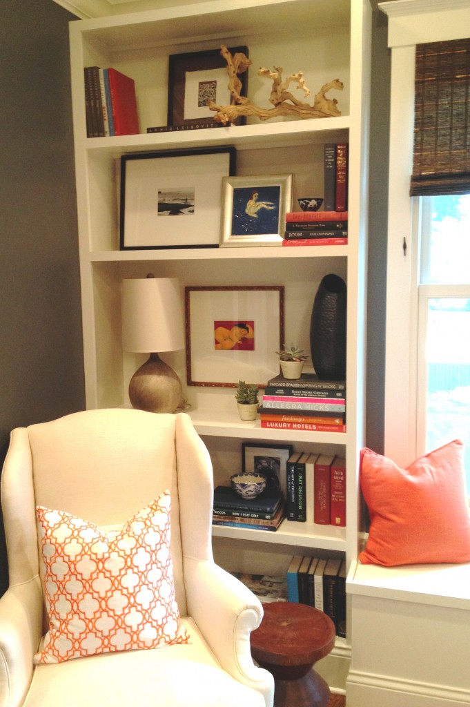
Full view of styled right side:
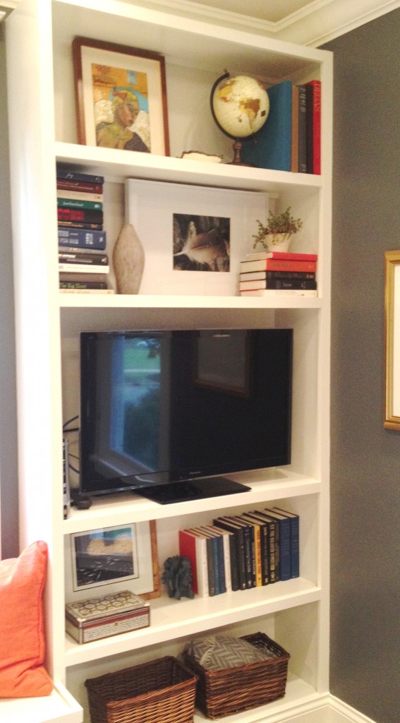
As you can see, we also moved the chair to create a reading nook near the lamp. While totally functional, the chair also adds dimension and interest to the room. It also serves the purpose of keeping the focus on the left side of the room rather than the right side which houses the TV–never something to highlight in my opinion!
Amy applied the same amazing skills that she used on my junk drawer to the bookshelves. I brought her all my favorite things and we played around with layering, texture, size…and of course, functionality. The best part is that we didn’t buy one thing for this project–everything came from my house!
Here’s what we did:
- We used different sized and colored frames, art, photographs and accessories and layered them on top of each other. We also used all hardcover books in different colors and pulled all the covers off.
- With the books, we also stacked them horizontally and vertically, pulled some to the front and some to the back. We used them as a way to create height when needed–example using them to prop up the dark grey vase that, along with the new lamp and large print, fills the big shelf on the left and balances the TV on the right.
- We used a lot of the room’s colors to create a cohesive feel–grey, black, brown and blue–but then added other pops of colors.
- A little greenery and natural woven baskets for storage of extra blankets and remotes provide texture and an organic feel.
- To keep things interesting by not having all the pictures leaning, we hung one of the prints on the back of the largest shelf on the left with Command Strips–that way we didn’t ruin the paint job.
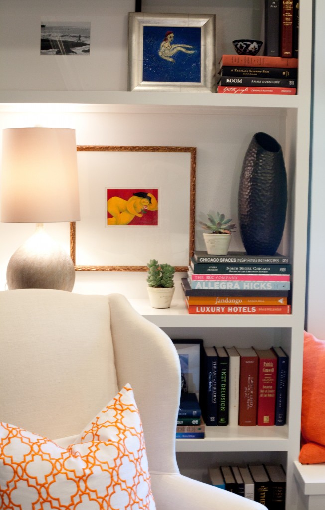
From the shot above, to the shot below, you can see we wrapped the cord and hid it behind the lamp so that when you enter the room you don’t see any cords–when I built the shelves I made sure to move all the electrical to the bottom edges of the big shelves to accommodate a lamp and the TV. If you recognize the lamp, it was moved from my entry console to the bedroom built-ins because the height and depth worked perfectly…now need to get something new for the entry…the hunt begins! (Side note, here’s the source for the lamp.)
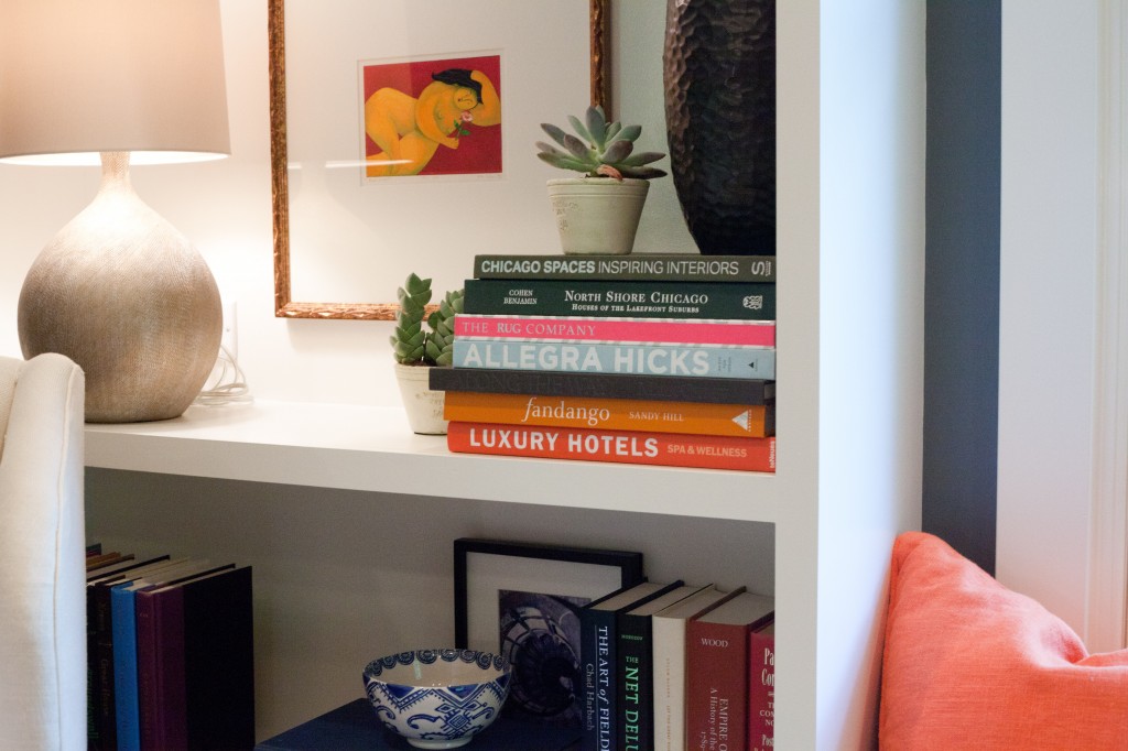
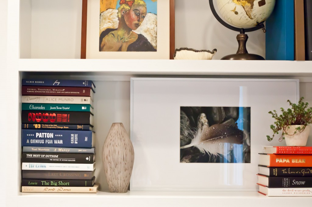
As we said yesterday, the most important thing is to make it personal–you’ll like it more that way. Above you’ll see on the left side of my bookcases I have a picture I took on my honeymoon in Bali behind a painting done by my Dad, Bill McCann. Below, the photograph of the feather was taken by my sister-in-law, Lacey Bediz, and on the upper shelf another painting by my Dad. The globe is just a cheap one from Target–I love globes and what they represent.
And here it is again, the final shot (well, before a bench cushion!)
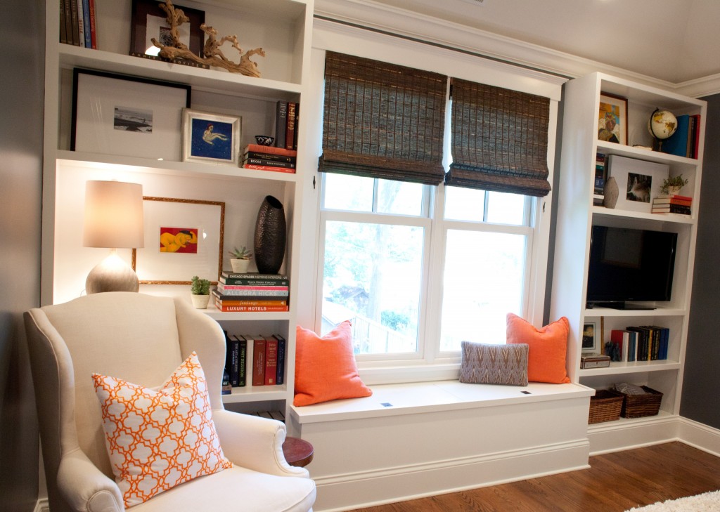
We hope you like them. (BTW, My husband told me tonight he likes the before better–but he would have been happy if I’d designed the room to have him sleeping in nothing but a cardboard box as long as he had his TV!) We wanted to show you ideas can really be applied. Let us know if you have any additional questions! And if you’re new to the blog and want to see pictures of the room before we put in the built-ins here’s where you can go.


Tessa–I finally had a chance to visit your blog and its amazing! The first post I read and was already inspired. Care to share where you found that great white and orange pillow in the chair?
Thanks Karli! The orange and white pillow is from the 75% off shelf at Z Gallerie last winter. You could try Z Gallerie for something similar or search on etsy–i searched trellis orange white pillow and found lots of options.
You two are really inspiring me this summer…have decided to do a mini makeover in my kitchen (new pendant lights over the island) along with new backsplash, a splash of new paint in the bathrooms…am going to wait for the rest of the house until my boys stop banging into the walls with themselves and their toys, and I actually put some thought into our garden this year. Thanks for the all the fabulous ideas! With the prospect of moving being several years away, these projects are all helping me to practice a little creativity and love the space I’m in.
Looks great, ladies! I love the pillow on the arm chair coordinating with the solid orange pillows on the bench. Fresh and inviting!
Where are you when I need such talent!
Looks great Tess
looks great, guys!