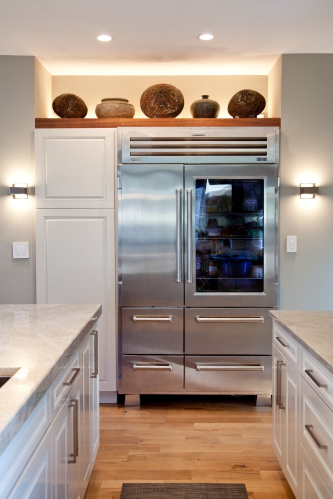
Friday was a great day spent at the Designer Kitchens of the North Shore event. Seven beautiful homes with even more beautiful kitchens, each one very different. Tons of info here so bear with me! Here were a few of our favorites…
Both of us picked the sleek, yet incredibly warm stunner of designer Sarah Dippold and her husband Matt as our overall favorite.
A grand, eclectic European style family kitchen by Susan Fredman Design Group’s Terri Crittenden (interestingly enough, the home owners are Terri’s brother and sister-in-law…talk about pressure!)

A perfect example of how traditional materials become more contemporary by mixing them together–different woods, countertops, backsplash come together in a New England inspired kitchen from Morgante Wilson Architects.


We also had the chance to have lunch with Karl Sponholz, Finalist Season Six Design Star, and Jann Parr, Editor of Chicago Home + Garden. Some of the key points we pulled away from the discussion:
- Don’t rush the process–take your time and find the right solutions for your budget.
- Looking for a quick spruce up, reface your cabinet doors and freshen up your backsplash (but we all knew that already!)
- Mix it up! Whether it’s traditional and modern finishes or different materials, having variety in your kitchen will help break up a large space–definitely evident in the spaces highlighted on the tour.
- Don’t design your kitchen for the one day a year when you entertain 30 people–it should fit everyday living.
- The line between the kitchen and the living space is continues to become increasingly blurred.
Karl pinpointed a few of the trends he’s seeing:
- Glass/porcelain is taking over natural stone for backsplashes.
- While granite is still a great option for durability and resale, quartzite is gaining speed for its uniformity in color and appearance.
- In cabinetry, after a good long run espresso brown is starting to move aside for more walnut and caramel wood tones. Also, gray is the new neutral.
- North Americans haven’t really jumped on the glossy euro cabinet trend quite yet, but we’re seeing it more (particularly in urban areas.)
- Stainless steel appliances are still the top choice; big hoods still are an in-demand feature.
- On the way out: recessed canned lighting…unfortunately it’s not quite clear what exactly will replace these lights so we recommend holding off on ripping into your ceilings.
- And, don’t forget to make room for a walk-in pantry.
And btw, after the post about my kitchen last week, I was super happy to hear that white kitchens are still having a good run (phew!)
Drop us a note if you have any additional thoughts on kitchens trends.


Great advice to homeowners, glad you enjoyed the tour!
Thank you Tessa & Amy! I appreciate your kind words. It was so nice to meet you both at the Jr League Kitchen Tour! I’ll be following, and I wish you two continued success!
Thank you Amy & Tessa! It was a pleasure meeting you both at the Jr League Kitchen Tour! I love the Blog!
Tess: when you’re here, remind me to show you our architect’s original design for the kitchen which included a walk-in pantry, as you recommend. In fact, our builder came up with a much more space-efficient design by lining an entire wall with cabinets instead of eating into our already limited floor space with a walk-in pantry. Walk-ins are great if you have lots of space, but consider that most of the space inside a walk-in pantry is space for your body to move around–not storage! I’d rather have the body space on the outside of my pantry, thereby making my kitchen larger. Makes a world of difference.
Lots of good advice, sounds like a positive tour!