In November we announced the official launch of our design services and with that announcement we gave away a Two Perspectives Design Board as a special thank you to our readers. Nicole from Illinois won the giveaway and decided to have us tackle her master bedroom. She recently purchased a new home and was struggling with this room–it’s large, has high ceilings and unusual asymmetrical windows. Ultimately, she’s overwhelmed with where to place furniture so that it makes sense of these windows and helps fill the space without feeling too crowded.
Here are a few shots of what the room looks like now:
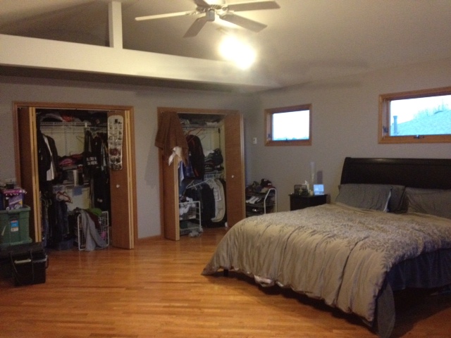
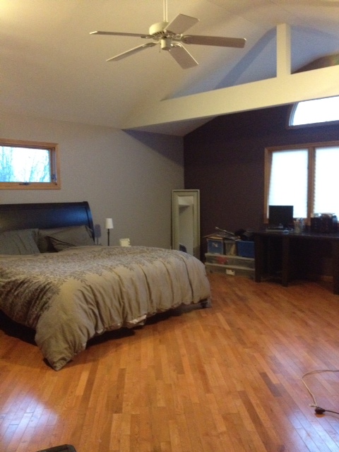
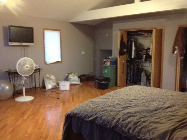
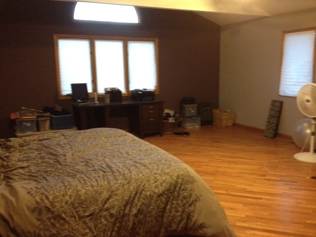
Two things have to remain in the room–the bed and the TV. Otherwise, she’s up for change!
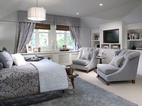
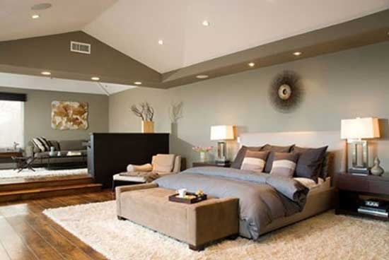
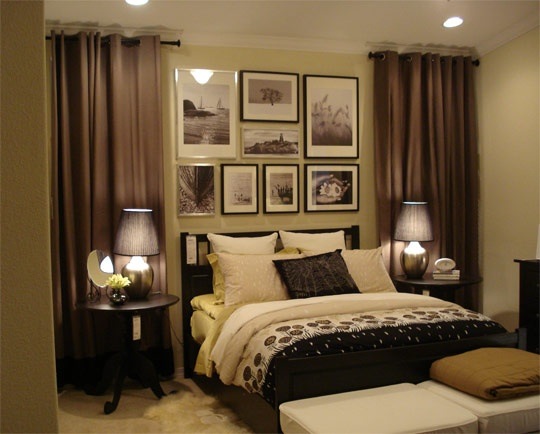
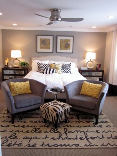
As a first step, we asked Nicole to share pictures of rooms she likes. Here are a few inspiration shots she sent us along with her comments:
“A little more traditional and monotone than I would like but furniture placement is nice.”
‘Like this, except would like more color.”
“Like how warm and personal this space is.”
“Love the mix of patterns and pops of yellow and the seating placement.”
Step two is laying out a furniture plan that addresses her needs. Check back tomorrow when we will reveal our own inspiration photos and a room layout plan! On Wednesday, we’ll show you the design board we created


One comment on “Step One of a Reader’s Bedroom Makeover: Before Pics and Her Inspiration”