So, as our final step on the makeover of a reader’s master bedroom, we have our inspiration design board. Nicole won our giveaway for a design board last November and we set out to create a serene master retreat for this hard-working mom.
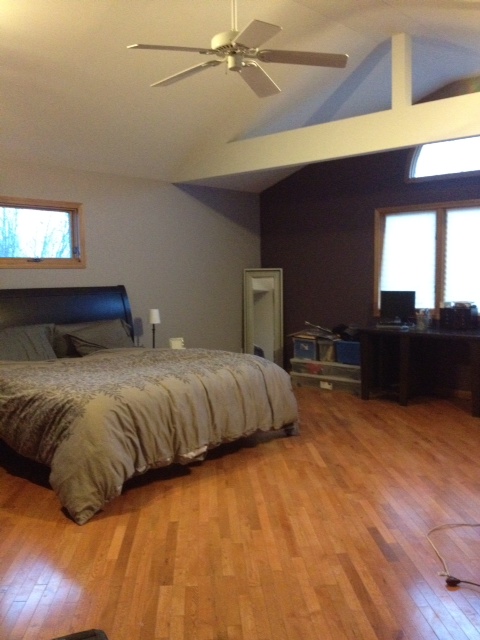
Here’s what her space currently looks like (you can see more photos here):
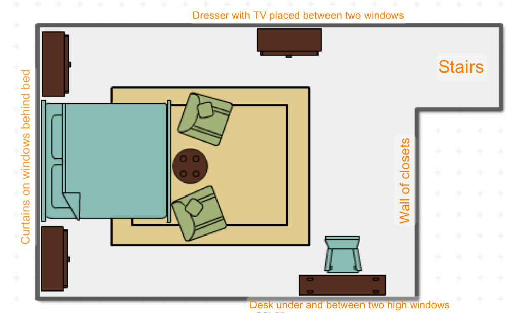
We pulled together our inspiration photos and agreed on a new layout for the room that fulfilled the need for sleeping, relaxing and working…
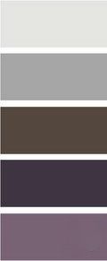
…and a color palette for her room that was gender neutral (with just a touch of femininity!), but with an interesting pop of color…
…and finally, we put together her design board. A big priority was making sure that the room is affordable. So, when choosing options for her new master retreat, for the most part, we used items from mainstream, lower-priced sources. Generally these stores also don’t overturn their merchandise too often so Nicole can execute against her plan gradually.
1) We’d pick a muted greyish taupe tone for the walls so that things remain bright–this would include painting over the current accent wall for a more consistent feel in the room.
2) On the large window, we’d use simple white curtains on a long rod that would extend a few feet past the end of the window on both sides. For privacy and ease of not having to open and close the drapes (since they’re behind a bed) we’d recommend installing bamboo shades in a light taupe/grey–this would provide some texture as well. These shades would also be installed on the other four windows in the room. We would not worry about the oval window–these are really hard to cover and since privacy isn’t an issue with that high of a window, we would recommend just leaving it alone.
3) We’d start to bring color in on the bed linens with this set from IKEA–it adds a nice, feminine touch to the room and would work well with her dark sleigh bed. Under the bed and seating area, we’d suggest a fun, ivory shag that would be cozy and bring a new texture to the room–since the room is relatively neutral in its color palette, it’s important to bring in different textures for interest.
4) On either side of the bed, we suggest using these two small dressers in a grey wash from IKEA and mirrored lamps from World Market–the lamps would add a little glam to the room. We like the use of dressers given the size of the bed and window–they’re an affordable option over large bedside tables that would be needed for balance.
5) A large dresser could be brought in to tie in with the dark wood bed. This would be used to provide a base for the television. The TV would just be either mounted right above the dresser or on a stand on the dresser–either way, we recommend having it swivel so there’s the option of watching TV from the bed.
6) Two upholstered chairs would sit at the base of the bed with a small mirrored table between them–adding to that touch of glam, a different texture and balancing out the two mirrored lamps. We love the idea of a couple of mismatched pillows in different purple patterns on the chairs and perhaps a couple of bigger throw pillows for the floor (so kids can come in and watch TV!)
7) Finally, our desk area would consist of a white lacquered parsons-style desk with a purple upholstered chair. We thought it would be fun to bring a lighter piece of furniture into the room since there are three dressers. We love the idea of a large sunburst mirror over the desk between the two high windows. This would help balance the larger windows in the room.
So, there you have Nicole’s master retreat. As you can see, it was very much about trying to balance things in the room because of all the different window sizes and shapes. We’ll keep you posted on what she decides to do now that she has a plan!


LOVE IT ALL!! Will look amazing once it’s done — such elegant, modern, beautiful choices. Great job!!
GREAT design, you two!
looks awesome!!! i love how it feels very high-end/designer, yet you used very affordable items that anyone can find. also love how well you used the space. can’t wait to see how she executes it!