Like Amy, I’ve been slowly tackling my design to do list for 2013. One of the bigger projects that I’ve decided to take on is redoing by powder room (yes, I know, this wasn’t on my original New Year’s resolutions list, but did you really expect me to stick to that slim thing?!?) Here are a couple of shots of our powder room as it currently looks (potty and all.)
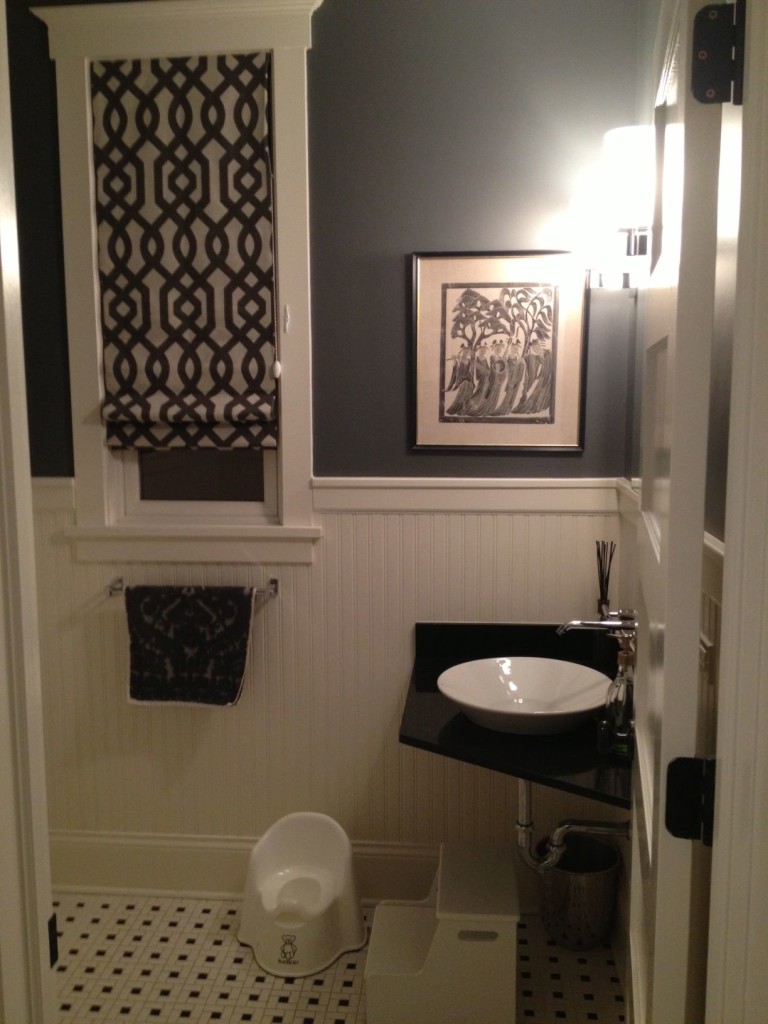
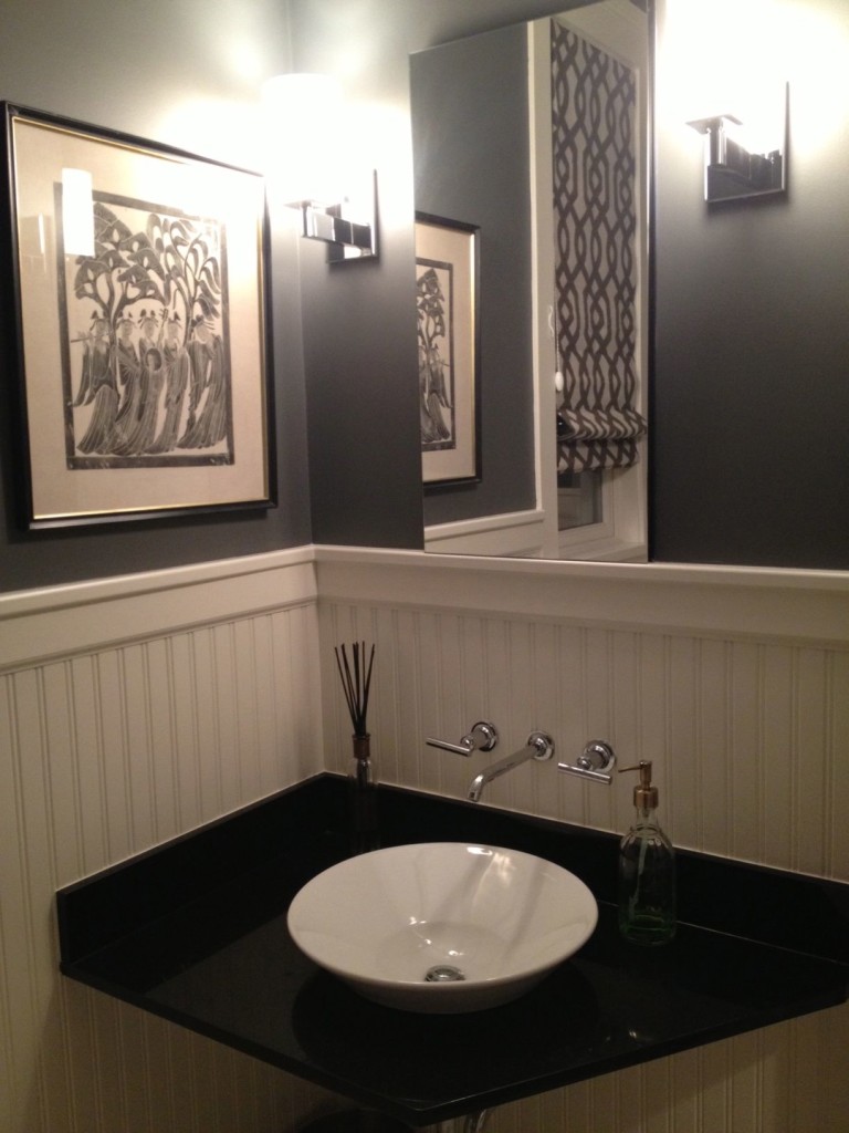
We haven’t done a whole lot to this room since we moved in. I knew that I didn’t like the overall look of it, but decided that we would live with it for a while and focus priorities elsewhere. I did, however, change out the original lighting (there used to be these really ornate iron sconces that didn’t go with the modern faucet and sink at all) for these sconces from Restoration Hardware. I also painted the walls a dark grey and put in a modern contemporary roman shade (original there were wood louvered blinds) and that graphic print did a lot to change up the room.
Now, I’m ready to start taking on the bigger project of redoing the whole thing. Here are some inspiration shots I’ve started gathering (btw, I’m pinning all of these and more to Pinterest so you can also follow me–or Amy.)
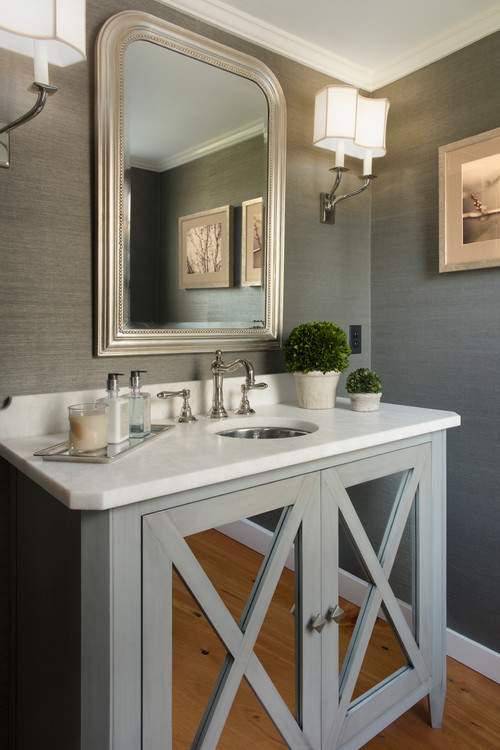
I know I want a clean, bright, relatively contemporary look but with classic features. I like the idea of doing simple shaker cabinet in grey and a marble (or quartzite for more durability) top. I know a pedestal is more traditional for a powder room, but with three kids, storage is at a premium and if I can suck out a place to store hand towels, tp, etc. then I’m going to do it!
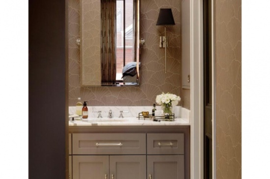
Adore grasscloth and think it would be great in the bathroom–my only concern would be wallpapering the entire wall…with three little kids and a dog, don’t think grasscloth would be the ideal solution.
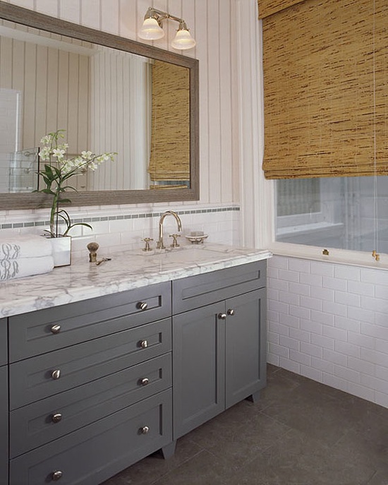
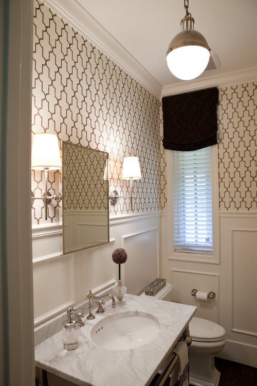
A more practical solution would be choosing a wall covering only on the top half of the wall. I’m looking at taking down the wainscoting in my bathroom, but my husband really likes its practicality (fancy that…) so I might replace it with someone more like the shot below. Also love the light in this shot.
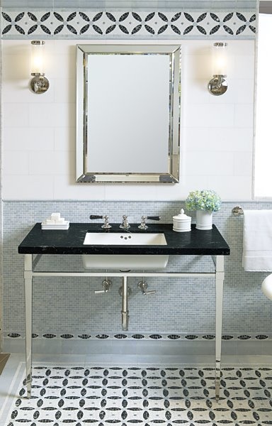
My other option is doing tile up part of the wall–definitely easy cleaning with kids!
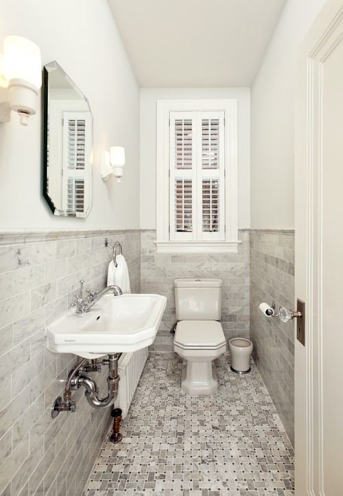
I’d also like to consider a square sink and this might be a good option if I have to keep the faucet plumbing where it is.
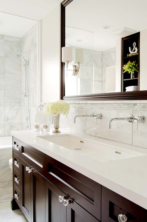
And finally, definitely want some kind of statement mirror
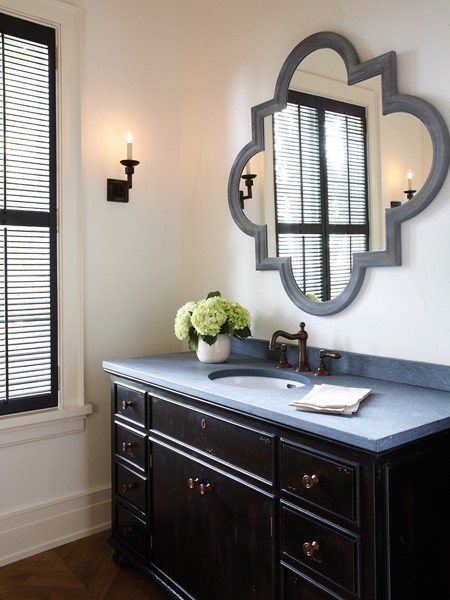
Just some initial thoughts I’ve been mulling over. Oh, and last consideration is maybe mixing it up and using brass with the grey-driven palette–little less expected than chrome or nickel.


Like your style! We just remodeled two of our bathrooms and the powder room is very similar to yours with Benjamin Moore’s “Porcini” on the walls. The master bath is similar to your Wick Design photo. I’ve yet to get pics up but here’s my Pinterest inspiration to share: http://pinterest.com/birdinhandvtg/bath-remodel/
whaaa? how come your ‘before’ shots always look like MY dream ‘after’ shots for my house?