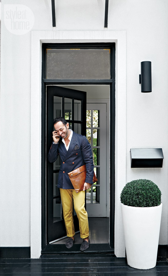
After Amy’s last post about mascara for your windows, I remembered this great house I saw on Style at Home‘s site with an amazing “mascara for your front door” entrance.
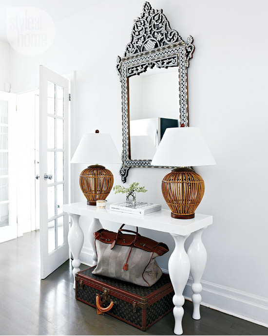
What you can tell from the front door, is that the designer, Montana Burnett, played with different styles and scale to create that eclectic look. In the photo above, I love how a boxwood (traditional) is in a large (modern) planter and set in front of a (traditional) door. And, it just gets better inside. Love the tone the luggage sets in the entrance–like the owner is ready to run off to some exotic locale (or maybe he’s just like me and hasn’t unpacked yet from the last trip!)
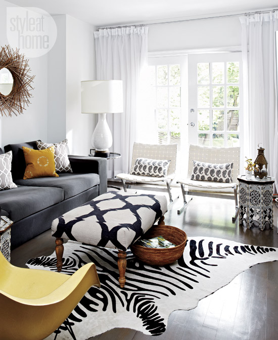
Inside, the debate of old vs. new and big vs. small continues. Modern chairs paired with a traditionally-legged ottoman and huge lamp on small side table.
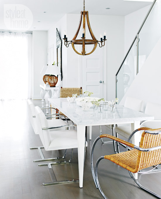
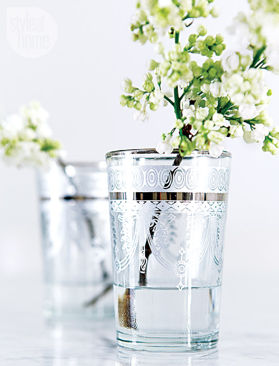
Traditional chandelier over a modern table and chairs. And, what about those little glasses with a single stem sitting in this large space.
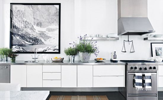
Love the large photo in the kitchen. By keeping the palette really clean, the home still feels uncluttered despite lots of different shapes and sizes.
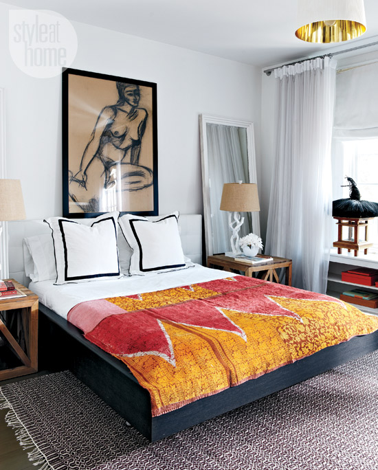
In the bedroom, the large bedside mirror is unexpected.
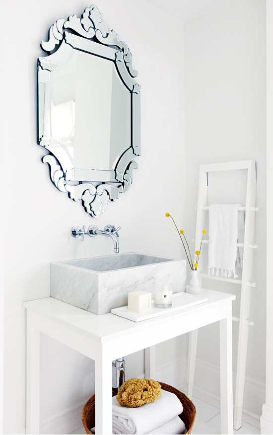
The gorgeous venetian mirror with the square marble sink–wow.
I love how mixing up styles and playing with scale contributes to the eclectic feel of this home. All too often we worry about whether or not something “fits” a room and I think this house is a great example of how you can really mix things up.

